
Here's my take. The line on the top is a little thicker than I like, but we have the same thickness in oVirt (I checked). I'm ok with shrinking it in both places. I put in the logo from the oVirt login page. I added patternfly and bootstrap. Changed the font to OpenSans. Positioned things and fixed paddings. Changed the button and form field to patternfly type (blue button) Best wishes, Greg On Fri, May 5, 2017 at 2:15 AM, Roy Golan <rgolan@redhat.com> wrote:
Adding UX people +Eldan Hildesheim <info@eldanet.com> +Alexander Wels <awels@redhat.com> +Greg Sheremeta <gshereme@redhat.com>
On Fri, May 5, 2017 at 2:32 AM Martin Perina <mperina@redhat.com> wrote:
On Thu, May 4, 2017 at 1:13 PM, Nir Soffer <nsoffer@redhat.com> wrote:
On Thu, May 4, 2017 at 4:26 PM Evgheni Dereveanchin <ederevea@redhat.com> wrote:
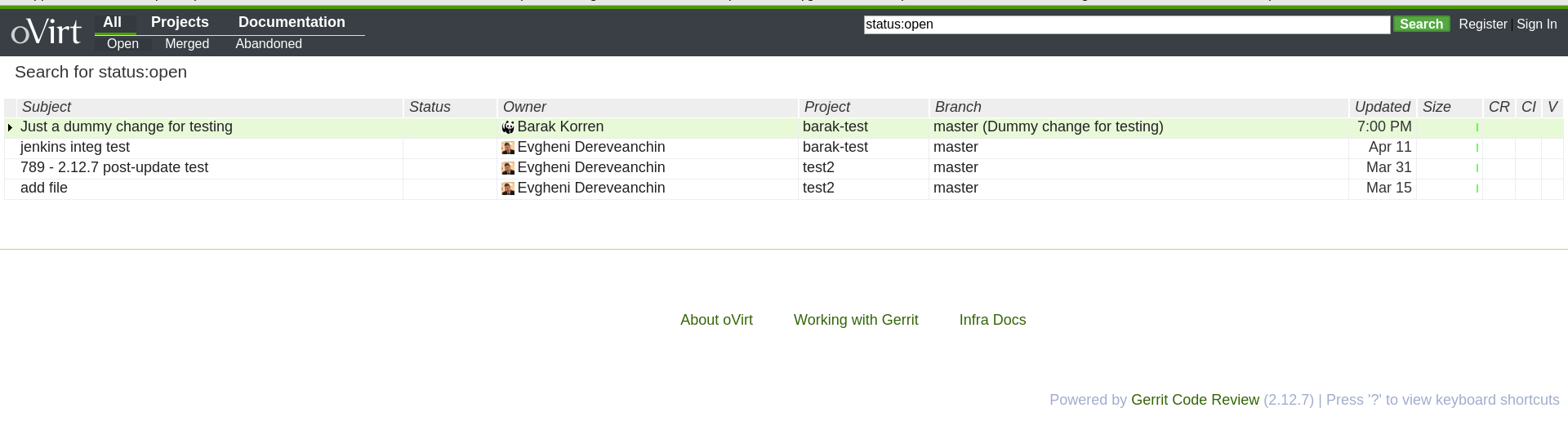
Thanks everyone for the great feedback!
So there's two options I see now: 1) keep the default header scheme with white background, just add the project logo into the corner 2) try to adapt to the Patternfly scheme as used in oVirt's Admin UI currently.
I've swapped the header background color to #393f45 as used in oVirt for a quick test: https://gerrit-staging.phx.ovirt.org/
Looks good!
Much better for my eyes now, thanks a lot!
The oVirt logo needs little more space around it, and it also should be centered vertically. Modifying the logo margin to 8px and width to 108px works for me using chrome, see attached screenshot.
[image: Screenshot from 2017-05-04 20-11-39.png]
Nir
Is this more readable? If yes - I can continue working in this direction
to add gradients and other patternfly style elements.
Otherwise I'll just go with option 1 and stick to the default style we
have now.
On Thu, May 4, 2017 at 2:45 PM, Martin Sivak <msivak@redhat.com> wrote:
It will help if someone can suggest an alternate CSS which we can use or specific color codes,
Well.. keep it as it is or make it really dark (like the patternfly menu). I do not care about logos but big area filled with non-neutral color is always going to be an issue.
Martin
On Thu, May 4, 2017 at 2:15 PM, Eyal Edri <eedri@redhat.com> wrote:
On Thu, May 4, 2017 at 3:05 PM, Martin Perina <mperina@redhat.com> wrote:
> I agree with Milan and Martin, even after few minutes looking at it, > the green > with combination of white background just made my eyes burning :-( > > Would it be possible to use more darker colors (at least for top > banner/menu)? > For example darker colors we use in oVirt engine welcome page ... >
Thanks for the feedback, It will help if someone can suggest an alternate CSS which we can use or specific color codes, otherwise it will be long trial and error process until we'll find something that will suite everyone.
> > > Martin > > On Thu, May 4, 2017 at 5:53 AM, Martin Sivak <msivak@redhat.com> > wrote: > >> I agree with Milan here. The light green background makes the menu >> items to be almost unreadable, the search button (slightly different >> green color) blends with the background and generally the color >> pulls >> my eyes away from the content. I wouldn't feel comfortable looking >> at >> the screen for a whole day. >> >> Martin >> >> On Thu, May 4, 2017 at 9:57 AM, Milan Zamazal <mzamazal@redhat.com> >> wrote: >> > Evgheni Dereveanchin <ederevea@redhat.com> writes: >> > >> >> The Infra team is working on customizing the look of Gerrit to >> make it fit >> >> better with other oVirt services. I want to share the result of >> this >> >> effort. Hopefully we can gather some feedback before applying >> the design to >> >> oVirt's instance of Gerrit. >> >> >> >> Please visit the Staging instance to check it out: >> >> >> >> https://gerrit-staging.phx.ovirt.org/ >> > >> > Thank you for the preview. While it fits better with oVirt >> services, >> > there is one thing that makes me uncomfortable with it: low >> contrast. >> > The top green bar is probably directly violating Web Accessibility >> > Guidelines (AA level; see >> > https://www.w3.org/TR/WCAG20/#visual-audio-contrast-contrast), >> but I >> > find all the green parts harder to read than in the current >> version. >> > So it would be nice if the contrast could be improved. >> > >> > Thanks, >> > Milan >> > _______________________________________________ >> > Devel mailing list >> > Devel@ovirt.org >> > http://lists.ovirt.org/mailman/listinfo/devel >> _______________________________________________ >> Devel mailing list >> Devel@ovirt.org >> http://lists.ovirt.org/mailman/listinfo/devel >> > > > _______________________________________________ > Infra mailing list > Infra@ovirt.org > http://lists.ovirt.org/mailman/listinfo/infra > >
--
Eyal edri
ASSOCIATE MANAGER
RHV DevOps
EMEA VIRTUALIZATION R&D
Red Hat EMEA <https://www.redhat.com/> <https://red.ht/sig> TRIED. TESTED. TRUSTED. <https://redhat.com/trusted> phone: +972-9-7692018 <+972%209-769-2018> irc: eedri (on #tlv #rhev-dev #rhev-integ)
_______________________________________________ Devel mailing list Devel@ovirt.org http://lists.ovirt.org/mailman/listinfo/devel
-- Regards, Evgheni Dereveanchin _______________________________________________ Devel mailing list Devel@ovirt.org http://lists.ovirt.org/mailman/listinfo/devel
_______________________________________________ Devel mailing list Devel@ovirt.org http://lists.ovirt.org/mailman/listinfo/devel
_______________________________________________ Infra mailing list Infra@ovirt.org http://lists.ovirt.org/mailman/listinfo/infra
-- Greg Sheremeta, MBA Sr. Software Engineer Red Hat, Inc. gshereme@redhat.com