UI Change Request - Navigation

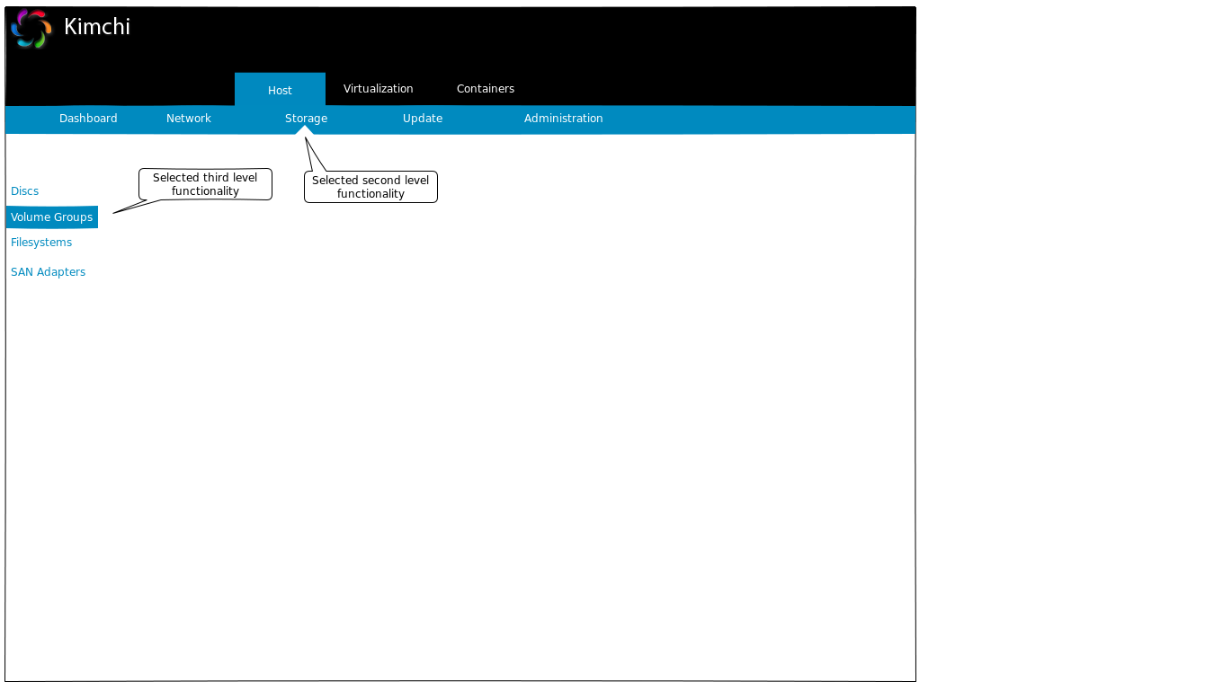
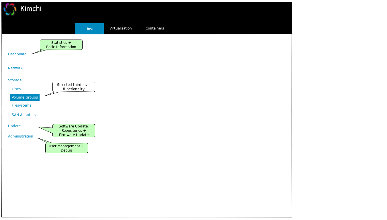
Hello Aline, I refer to the latest version of the User Interface Design Specification - Kimchi, 2014-12-23 (aka UI Design Spec) which defines the following structure of functionalities: *Host* (second level navigation via panel areas) Performance (System Statistics) Basic Information Repositories Debug Report Software Updates *Guests* no second level functionalities *Templates* no second level functionalities *Storage* no second level functionalities *Networks* no second level functionalities *Administration* (second level navigation via collapse/expand) Firmware Update SEP Configuration Power Options Configuration Backup Network Configuration SAN Adapters Sensor Monitor *Problem Statement* We already decided to move all Administration functionalities to Host (currently not updated in the UI Design Spec). We are currently facing the following problems: 1) Host now contains 12 second level functionalities, all other (Guests, Templates, ...) none. We need to introduce a second level navigation for Host other than collapse/expand 2) The navigation bar elements Storage and Network (refering to Virtualization) also exist in the Host context. This might confuse the user. *Proposal* The described problems can be solved with the following changes: 1) Introducing a second level navigation 2) Changing the structure of functionalities as follows: *Host* Performance (System Statistics) Basic Information Repositories Debug Report Software Updates Firmware Update SEP Configuration Power Options Configuration Backup Network Configuration SAN Adapters Sensor Monitor *Virtualization* Guests Templates Storage Networks *Containers (future extension)* to be defined Let's start a discussion on this. Kind regards Jan

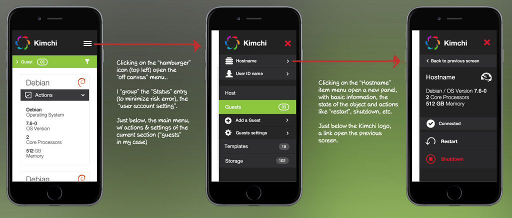
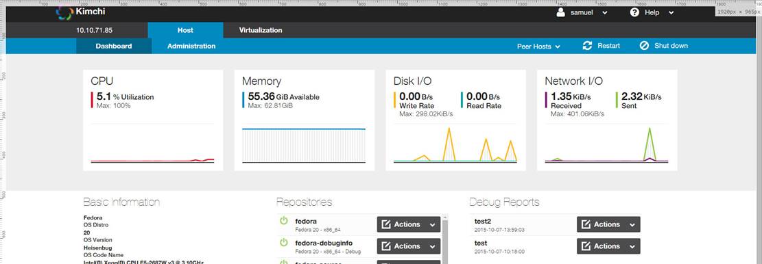
Hi Jan, I’m not sure if I’m following you. Did you mean changing the second-level navigation to tabs instead of panel areas? If so should we merge Hosts and Admin tab in one page and collapse the panels like old-ui behavior (maybe keeping the dashboard statistics on top unchanged) but with new-ui styles OR add two new tabs to the toolbar? I think the concept of accordion/collapsible elements works for Admin, but I don’t see it working for the panels on Hosts tab, unless we group Basic Information, Repositories and Debug Reports in one single collapsible area. I also discussed with Aline if we should move Peer Hosts from top to the toolbar and make it a plugin. Here’s a mockup I did with Chrome: [cid:image005.jpg@01D10286.CB9A5F20] [cid:image006.jpg@01D10286.CB9A5F20] The reason why I think all panels in these pages can’t be merged in one tab is because if all panels were collapsed, the page height would be around 3757 pixels. If admin items were hidden, it would be around 2108 tall. I believe we would have to set the accordions to hide other items when one item is collapsed. They don’t seem that tall in the PDF because the images were resized. I believe we have to study this following a “mobile-first” approach because once we all agree with the new design, even if we don’t include the mobile design in 2.0 release, we’ll have to keep some markup ready for responsive design to receive the new styles. I think this new tab design would need some updates in tab-ext.xml and the JS files before 2.0 release, assuming other people or teams would start developing new plugins from 2.0 and on. If we update how the tabs are built in the UI from 2.0 to 2.1 for instance, that may turn against us with retro compatibility issues. [cid:image007.jpg@01D10286.CB9A5F20] Regards, Samuel From: kimchi-devel-bounces@ovirt.org [mailto:kimchi-devel-bounces@ovirt.org] On Behalf Of Jan Schneider Sent: quinta-feira, 8 de outubro de 2015 13:10 To: Aline Manera <alinefm@linux.vnet.ibm.com> Cc: kimchi-devel@ovirt.org Subject: [Kimchi-devel] UI Change Request - Navigation Hello Aline, I refer to the latest version of the User Interface Design Specification - Kimchi, 2014-12-23 (aka UI Design Spec) which defines the following structure of functionalities: Host (second level navigation via panel areas) Performance (System Statistics) Basic Information Repositories Debug Report Software Updates Guests no second level functionalities Templates no second level functionalities Storage no second level functionalities Networks no second level functionalities Administration (second level navigation via collapse/expand) Firmware Update SEP Configuration Power Options Configuration Backup Network Configuration SAN Adapters Sensor Monitor Problem Statement We already decided to move all Administration functionalities to Host (currently not updated in the UI Design Spec). We are currently facing the following problems: 1) Host now contains 12 second level functionalities, all other (Guests, Templates, ...) none. We need to introduce a second level navigation for Host other than collapse/expand 2) The navigation bar elements Storage and Network (refering to Virtualization) also exist in the Host context. This might confuse the user. Proposal The described problems can be solved with the following changes: 1) Introducing a second level navigation 2) Changing the structure of functionalities as follows: Host Performance (System Statistics) Basic Information Repositories Debug Report Software Updates Firmware Update SEP Configuration Power Options Configuration Backup Network Configuration SAN Adapters Sensor Monitor Virtualization Guests Templates Storage Networks Containers (future extension) to be defined Let's start a discussion on this. Kind regards Jan
Hi Samuel, I just had a discussion with Walter. We found that we need up to two navigation levels under Host. The third navigation level however is not always required. Please have a look at the two attached proposals to understand our requirements. Kind regards Jan and Walter On 10/09/2015 04:36 PM, Samuel Henrique De Oliveira Guimaraes wrote:
Hi Jan,
I’m not sure if I’m following you. Did you mean changing the second-level navigation to tabs instead of panel areas? If so should we merge Hosts and Admin tab in one page and collapse the panels like old-ui behavior (maybe keeping the dashboard statistics on top unchanged) but with new-ui styles OR add two new tabs to the toolbar?
I think the concept of accordion/collapsible elements works for Admin, but I don’t see it working for the panels on Hosts tab, unless we group Basic Information, Repositories and Debug Reports in one single collapsible area.
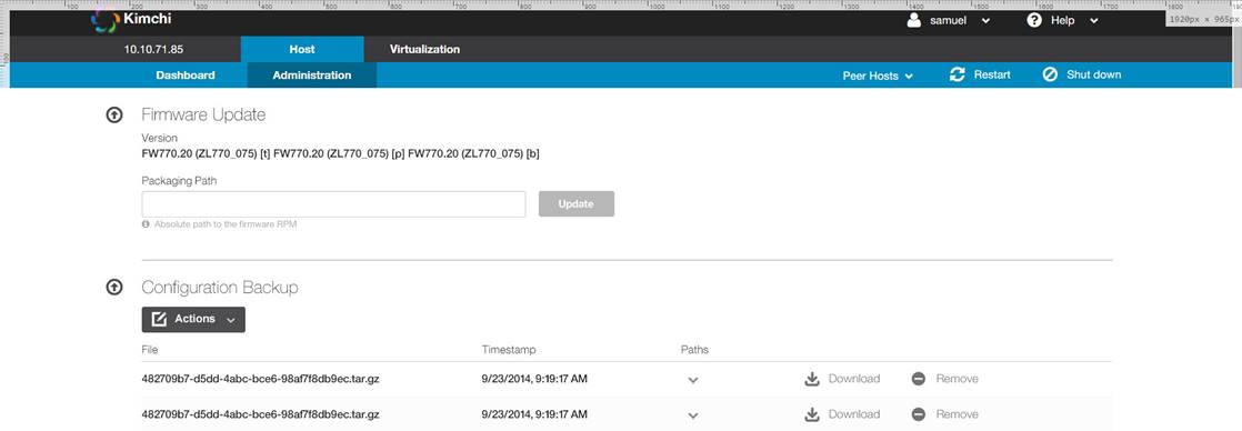
I also discussed with Aline if we should move Peer Hosts from top to the toolbar and make it a plugin. Here’s a mockup I did with Chrome:
The reason why I think all panels in these pages can’t be merged in one tab is because if all panels were collapsed, the page height would be around 3757 pixels. If admin items were hidden, it would be around 2108 tall. I believe we would have to set the accordions to hide other items when one item is collapsed. They don’t seem that tall in the PDF because the images were resized.
I believe we have to study this following a “mobile-first” approach because once we all agree with the new design, even if we don’t include the mobile design in 2.0 release, we’ll have to keep some markup ready for responsive design to receive the new styles. I think this new tab design would need some updates in tab-ext.xml and the JS files before 2.0 release, assuming other people or teams would start developing new plugins from 2.0 and on. If we update how the tabs are built in the UI from 2.0 to 2.1 for instance, that may turn against us with retro compatibility issues.
Regards,
Samuel
*From:*kimchi-devel-bounces@ovirt.org [mailto:kimchi-devel-bounces@ovirt.org] *On Behalf Of *Jan Schneider *Sent:* quinta-feira, 8 de outubro de 2015 13:10 *To:* Aline Manera <alinefm@linux.vnet.ibm.com> *Cc:* kimchi-devel@ovirt.org *Subject:* [Kimchi-devel] UI Change Request - Navigation
Hello Aline,
I refer to the latest version of the User Interface Design Specification - Kimchi, 2014-12-23 (aka UI Design Spec) which defines the following structure of functionalities:
*Host* (second level navigation via panel areas) Performance (System Statistics) Basic Information Repositories Debug Report Software Updates
*Guests* no second level functionalities
*Templates* no second level functionalities
*Storage* no second level functionalities
*Networks* no second level functionalities
*Administration* (second level navigation via collapse/expand) Firmware Update SEP Configuration Power Options Configuration Backup Network Configuration SAN Adapters Sensor Monitor
*Problem Statement*
We already decided to move all Administration functionalities to Host (currently not updated in the UI Design Spec).
We are currently facing the following problems: 1) Host now contains 12 second level functionalities, all other (Guests, Templates, ...) none. We need to introduce a second level navigation for Host other than collapse/expand 2) The navigation bar elements Storage and Network (refering to Virtualization) also exist in the Host context. This might confuse the user.
*Proposal*
The described problems can be solved with the following changes:
1) Introducing a second level navigation 2) Changing the structure of functionalities as follows:
*Host* Performance (System Statistics) Basic Information Repositories Debug Report Software Updates Firmware Update SEP Configuration Power Options Configuration Backup Network Configuration SAN Adapters Sensor Monitor
*Virtualization* Guests Templates Storage Networks
*Containers (future extension)* to be defined
Let's start a discussion on this.
Kind regards Jan
Hi, Although a lot of articles discourages mixing top-level tabs with sidebars, I think in this specific scenario we can make these patterns work but we have to make sure that the users won’t be redirected to a blank landing page or we’ll have to create one. For instance, suppose Containers second-level first item has three children, then when clicking in “Containers” on the top bar, the user should be redirected to the first item from this list (in the third level). I’ve done some prototypes in the past with similar patterns and for the standard user who navigates on web, this pattern of navigation is confusing. However the average virtualization, cloud, storage and network operator users are usually facing UIs more complex than this. Between the two proposals I’m voting for proposal 1 but I prefer using Hamburger Button to trigger a floating grouped-menu. This was proposed a few months ago in the ML. I was in a workshop with some developers from Globo.com (Brazilian news portal) two years ago when they were implementing this menu. The current version is way more polished than the one they presented at the time and I really like how it turned. I’m attaching a screenshot, but you can see it live with animations at http://g1.globo.com/. This discussion also brings another question, should new plugins be restricted only to new tabs on the first-level top bar or should we create some sort of “path” in tab-ext.xml? I.e a new plugin can be appended to a specific region on Hosts Dashboard, on the second-level (since Aline suggested moving Peer hosts to that area) or even create a new level on a menu option that previously had no child items. Regards, Samuel From: Jan Schneider [mailto:schneidj@linux.vnet.ibm.com] Sent: sexta-feira, 9 de outubro de 2015 13:06 To: Samuel Henrique De Oliveira Guimaraes <samuel.guimaraes@eldorado.org.br>; Aline Manera <alinefm@linux.vnet.ibm.com> Cc: kimchi-devel@ovirt.org Subject: Re: [Kimchi-devel] UI Change Request - Navigation Hi Samuel, I just had a discussion with Walter. We found that we need up to two navigation levels under Host. The third navigation level however is not always required. Please have a look at the two attached proposals to understand our requirements. Kind regards Jan and Walter On 10/09/2015 04:36 PM, Samuel Henrique De Oliveira Guimaraes wrote: Hi Jan, I’m not sure if I’m following you. Did you mean changing the second-level navigation to tabs instead of panel areas? If so should we merge Hosts and Admin tab in one page and collapse the panels like old-ui behavior (maybe keeping the dashboard statistics on top unchanged) but with new-ui styles OR add two new tabs to the toolbar? I think the concept of accordion/collapsible elements works for Admin, but I don’t see it working for the panels on Hosts tab, unless we group Basic Information, Repositories and Debug Reports in one single collapsible area. I also discussed with Aline if we should move Peer Hosts from top to the toolbar and make it a plugin. Here’s a mockup I did with Chrome: [cid:image001.jpg@01D10298.ADF2F380] [cid:image002.jpg@01D10298.ADF2F380] The reason why I think all panels in these pages can’t be merged in one tab is because if all panels were collapsed, the page height would be around 3757 pixels. If admin items were hidden, it would be around 2108 tall. I believe we would have to set the accordions to hide other items when one item is collapsed. They don’t seem that tall in the PDF because the images were resized. I believe we have to study this following a “mobile-first” approach because once we all agree with the new design, even if we don’t include the mobile design in 2.0 release, we’ll have to keep some markup ready for responsive design to receive the new styles. I think this new tab design would need some updates in tab-ext.xml and the JS files before 2.0 release, assuming other people or teams would start developing new plugins from 2.0 and on. If we update how the tabs are built in the UI from 2.0 to 2.1 for instance, that may turn against us with retro compatibility issues. [cid:image003.jpg@01D10298.ADF2F380] Regards, Samuel From: kimchi-devel-bounces@ovirt.org<mailto:kimchi-devel-bounces@ovirt.org> [mailto:kimchi-devel-bounces@ovirt.org] On Behalf Of Jan Schneider Sent: quinta-feira, 8 de outubro de 2015 13:10 To: Aline Manera <alinefm@linux.vnet.ibm.com><mailto:alinefm@linux.vnet.ibm.com> Cc: kimchi-devel@ovirt.org<mailto:kimchi-devel@ovirt.org> Subject: [Kimchi-devel] UI Change Request - Navigation Hello Aline, I refer to the latest version of the User Interface Design Specification - Kimchi, 2014-12-23 (aka UI Design Spec) which defines the following structure of functionalities: Host (second level navigation via panel areas) Performance (System Statistics) Basic Information Repositories Debug Report Software Updates Guests no second level functionalities Templates no second level functionalities Storage no second level functionalities Networks no second level functionalities Administration (second level navigation via collapse/expand) Firmware Update SEP Configuration Power Options Configuration Backup Network Configuration SAN Adapters Sensor Monitor Problem Statement We already decided to move all Administration functionalities to Host (currently not updated in the UI Design Spec). We are currently facing the following problems: 1) Host now contains 12 second level functionalities, all other (Guests, Templates, ...) none. We need to introduce a second level navigation for Host other than collapse/expand 2) The navigation bar elements Storage and Network (refering to Virtualization) also exist in the Host context. This might confuse the user. Proposal The described problems can be solved with the following changes: 1) Introducing a second level navigation 2) Changing the structure of functionalities as follows: Host Performance (System Statistics) Basic Information Repositories Debug Report Software Updates Firmware Update SEP Configuration Power Options Configuration Backup Network Configuration SAN Adapters Sensor Monitor Virtualization Guests Templates Storage Networks Containers (future extension) to be defined Let's start a discussion on this. Kind regards Jan

Hi Samuel, my comments are from a user point of view, I'm relying on your insights when comes to technical doabilty. Thanks, Walter. On 09.10.2015 21:07, Samuel Henrique De Oliveira Guimaraes wrote:
Hi,
Although a lot of articles discourages mixing top-level tabs with sidebars, I think in this specific scenario we can make these patterns work but we have to make sure that the users won’t be redirected to a blank landing page or we’ll have to create one.
For instance, suppose Containers second-level first item has three children, then when clicking in “Containers” on the top bar, the user should be redirected to the first item from this list (in the third level).
I’ve done some prototypes in the past with similar patterns and for the standard user who navigates on web, this pattern of navigation is confusing. However the average virtualization, cloud, storage and network operator users are usually facing UIs more complex than this.
Good point. Makes sense to me.
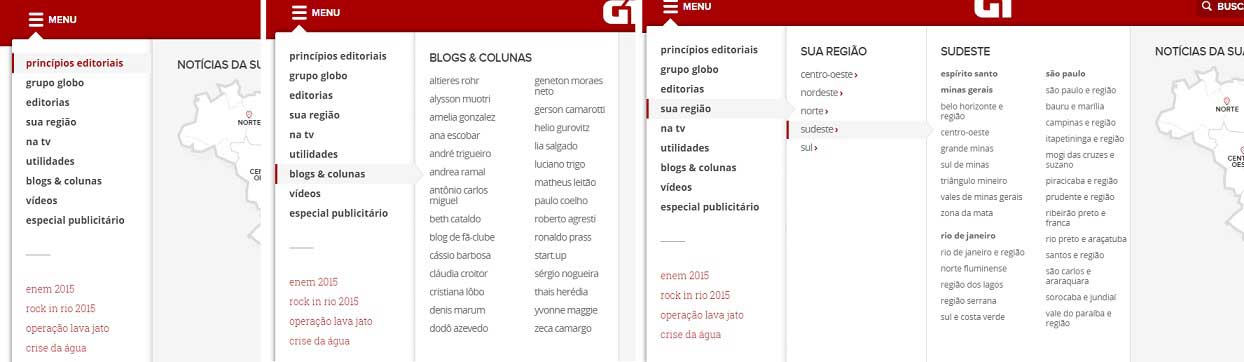
Between the two proposals I’m voting for proposal 1 but I prefer using Hamburger Button to trigger a floating grouped-menu. This was proposed a few months ago in the ML.
I was in a workshop with some developers from Globo.com (Brazilian news portal) two years ago when they were implementing this menu. The current version is way more polished than the one they presented at the time and I really like how it turned. I’m attaching a screenshot, but you can see it live with animations at http://g1.globo.com/.
I like a lot of the aspects from what's implemented on the globo.com page: - the menue doesn't take away any real estate from your screen, therefore having an additional level of navigation isn't such a big issue. - you can get to your target menue in one click - from what I see, it gives you the possibility to turn back on the previous level tabs with just one click. Did I get that right ? If all this is right, then I'm perfectly ok with this proposal.
This discussion also brings another question, should new plugins be restricted only to new tabs on the first-level top bar or should we create some sort of “path” in tab-ext.xml? I.e a new plugin can be appended to a specific region on Hosts Dashboard, on the second-level (since Aline suggested moving Peer hosts to that area) or even create a new level on a menu option that previously had no child items.
Our base assumption was that plugins wouldn't be restricted to new tabs only when using the new framework. Based on that assumption we decided that the functionality which was in the Administration tab in the old design, would now be extending the functionality of the Host tab in the new design. Ideally a new plugin could be extending functionality on any level, and even on multiple levels. Here the use cases I'm aware of: - plugin as a new tab --> for example containers may be one - plugin extending an existing tab --> Ginger extending the Host tab which was created by Ginger-common --> Aline's example with the peer hosts - plugin extending one or more individual UI-panels with functionality --> Gingers390x plugin offering "Enable/Add Network", "Enable/Add SAN Adapter" Action-button on the Networking and Storage screens since these are platform specific functions implemented in this specific plugin Samuel, could we cover all these use-cases via the approach you mentioned as the "sort of path in tab-ext.xml" ? I guess that would be great because it sounds very flexible.
Regards,
Samuel
*From:*Jan Schneider [mailto:schneidj@linux.vnet.ibm.com] *Sent:* sexta-feira, 9 de outubro de 2015 13:06 *To:* Samuel Henrique De Oliveira Guimaraes <samuel.guimaraes@eldorado.org.br>; Aline Manera <alinefm@linux.vnet.ibm.com> *Cc:* kimchi-devel@ovirt.org *Subject:* Re: [Kimchi-devel] UI Change Request - Navigation
Hi Samuel,
I just had a discussion with Walter. We found that we need up to two navigation levels under Host. The third navigation level however is not always required. Please have a look at the two attached proposals to understand our requirements.
Kind regards Jan and Walter
On 10/09/2015 04:36 PM, Samuel Henrique De Oliveira Guimaraes wrote:
Hi Jan,
I’m not sure if I’m following you. Did you mean changing the second-level navigation to tabs instead of panel areas? If so should we merge Hosts and Admin tab in one page and collapse the panels like old-ui behavior (maybe keeping the dashboard statistics on top unchanged) but with new-ui styles OR add two new tabs to the toolbar?
I think the concept of accordion/collapsible elements works for Admin, but I don’t see it working for the panels on Hosts tab, unless we group Basic Information, Repositories and Debug Reports in one single collapsible area.
I also discussed with Aline if we should move Peer Hosts from top to the toolbar and make it a plugin. Here’s a mockup I did with Chrome:
imap://niklaus@imap.linux.ibm.com:993/fetch%3EUID%3E.INBOX%3E934?header=quotebody&part=1.1.2&filename=image001.jpg
imap://niklaus@imap.linux.ibm.com:993/fetch%3EUID%3E.INBOX%3E934?header=quotebody&part=1.1.3&filename=image002.jpg
The reason why I think all panels in these pages can’t be merged in one tab is because if all panels were collapsed, the page height would be around 3757 pixels. If admin items were hidden, it would be around 2108 tall. I believe we would have to set the accordions to hide other items when one item is collapsed. They don’t seem that tall in the PDF because the images were resized.
I believe we have to study this following a “mobile-first” approach because once we all agree with the new design, even if we don’t include the mobile design in 2.0 release, we’ll have to keep some markup ready for responsive design to receive the new styles. I think this new tab design would need some updates in tab-ext.xml and the JS files before 2.0 release, assuming other people or teams would start developing new plugins from 2.0 and on. If we update how the tabs are built in the UI from 2.0 to 2.1 for instance, that may turn against us with retro compatibility issues.
imap://niklaus@imap.linux.ibm.com:993/fetch%3EUID%3E.INBOX%3E934?header=quotebody&part=1.1.4&filename=image003.jpg
Regards,
Samuel
*From:*kimchi-devel-bounces@ovirt.org <mailto:kimchi-devel-bounces@ovirt.org>[mailto:kimchi-devel-bounces@ovirt.org] *On Behalf Of *Jan Schneider *Sent:* quinta-feira, 8 de outubro de 2015 13:10 *To:* Aline Manera <alinefm@linux.vnet.ibm.com> <mailto:alinefm@linux.vnet.ibm.com> *Cc:* kimchi-devel@ovirt.org <mailto:kimchi-devel@ovirt.org> *Subject:* [Kimchi-devel] UI Change Request - Navigation
Hello Aline,
I refer to the latest version of the User Interface Design Specification - Kimchi, 2014-12-23 (aka UI Design Spec) which defines the following structure of functionalities:
*Host* (second level navigation via panel areas) Performance (System Statistics) Basic Information Repositories Debug Report Software Updates
*Guests* no second level functionalities
*Templates* no second level functionalities
*Storage* no second level functionalities
*Networks* no second level functionalities
*Administration* (second level navigation via collapse/expand) Firmware Update SEP Configuration Power Options Configuration Backup Network Configuration SAN Adapters Sensor Monitor
*Problem Statement*
We already decided to move all Administration functionalities to Host (currently not updated in the UI Design Spec).
We are currently facing the following problems: 1) Host now contains 12 second level functionalities, all other (Guests, Templates, ...) none. We need to introduce a second level navigation for Host other than collapse/expand 2) The navigation bar elements Storage and Network (refering to Virtualization) also exist in the Host context. This might confuse the user.
*Proposal*
The described problems can be solved with the following changes:
1) Introducing a second level navigation 2) Changing the structure of functionalities as follows:
*Host* Performance (System Statistics) Basic Information Repositories Debug Report Software Updates Firmware Update SEP Configuration Power Options Configuration Backup Network Configuration SAN Adapters Sensor Monitor
*Virtualization* Guests Templates Storage Networks
*Containers (future extension)* to be defined
Let's start a discussion on this.
Kind regards Jan
_______________________________________________ Kimchi-devel mailing list Kimchi-devel@ovirt.org http://lists.ovirt.org/mailman/listinfo/kimchi-devel
Hi Samuel, today I got reminded that we have to pass the accessability tests with our UI and was searching if the hamburger meneu design would be in the way of this requirement. I didn't find any clear statement about it but I got a lot of hits on why to not use hamburger menus: http://courtneyengle.com/2014/06/24/mobile-responsive-navigation-accessibili... http://techcrunch.com/2014/05/24/before-the-hamburger-button-kills-you/ https://lmjabreu.com/post/why-and-how-to-avoid-hamburger-menus/ In order to get some feedback or new ideas I contacted a UI-guy I know from a former project and he pointed me to this: http://www.ibm.com/design/language/framework/visual/introduction This is in fact reflecting exactly the concept we need. Please let me know what you think about it. Thanks, Walter. On 12.10.2015 16:03, Walter Niklaus wrote:
Hi Samuel,
my comments are from a user point of view, I'm relying on your insights when comes to technical doabilty.
Thanks, Walter.
On 09.10.2015 21:07, Samuel Henrique De Oliveira Guimaraes wrote:
Hi,
Although a lot of articles discourages mixing top-level tabs with sidebars, I think in this specific scenario we can make these patterns work but we have to make sure that the users won’t be redirected to a blank landing page or we’ll have to create one.
For instance, suppose Containers second-level first item has three children, then when clicking in “Containers” on the top bar, the user should be redirected to the first item from this list (in the third level).
I’ve done some prototypes in the past with similar patterns and for the standard user who navigates on web, this pattern of navigation is confusing. However the average virtualization, cloud, storage and network operator users are usually facing UIs more complex than this.
Good point. Makes sense to me.
Between the two proposals I’m voting for proposal 1 but I prefer using Hamburger Button to trigger a floating grouped-menu. This was proposed a few months ago in the ML.
I was in a workshop with some developers from Globo.com (Brazilian news portal) two years ago when they were implementing this menu. The current version is way more polished than the one they presented at the time and I really like how it turned. I’m attaching a screenshot, but you can see it live with animations at http://g1.globo.com/.
I like a lot of the aspects from what's implemented on the globo.com page: - the menue doesn't take away any real estate from your screen, therefore having an additional level of navigation isn't such a big issue. - you can get to your target menue in one click - from what I see, it gives you the possibility to turn back on the previous level tabs with just one click. Did I get that right ? If all this is right, then I'm perfectly ok with this proposal.
This discussion also brings another question, should new plugins be restricted only to new tabs on the first-level top bar or should we create some sort of “path” in tab-ext.xml? I.e a new plugin can be appended to a specific region on Hosts Dashboard, on the second-level (since Aline suggested moving Peer hosts to that area) or even create a new level on a menu option that previously had no child items.
Our base assumption was that plugins wouldn't be restricted to new tabs only when using the new framework. Based on that assumption we decided that the functionality which was in the Administration tab in the old design, would now be extending the functionality of the Host tab in the new design. Ideally a new plugin could be extending functionality on any level, and even on multiple levels. Here the use cases I'm aware of: - plugin as a new tab --> for example containers may be one - plugin extending an existing tab --> Ginger extending the Host tab which was created by Ginger-common --> Aline's example with the peer hosts - plugin extending one or more individual UI-panels with functionality --> Gingers390x plugin offering "Enable/Add Network", "Enable/Add SAN Adapter" Action-button on the Networking and Storage screens since these are platform specific functions implemented in this specific plugin
Samuel, could we cover all these use-cases via the approach you mentioned as the "sort of path in tab-ext.xml" ? I guess that would be great because it sounds very flexible.
Regards,
Samuel
*From:*Jan Schneider [mailto:schneidj@linux.vnet.ibm.com] *Sent:* sexta-feira, 9 de outubro de 2015 13:06 *To:* Samuel Henrique De Oliveira Guimaraes <samuel.guimaraes@eldorado.org.br>; Aline Manera <alinefm@linux.vnet.ibm.com> *Cc:* kimchi-devel@ovirt.org *Subject:* Re: [Kimchi-devel] UI Change Request - Navigation
Hi Samuel,
I just had a discussion with Walter. We found that we need up to two navigation levels under Host. The third navigation level however is not always required. Please have a look at the two attached proposals to understand our requirements.
Kind regards Jan and Walter
On 10/09/2015 04:36 PM, Samuel Henrique De Oliveira Guimaraes wrote:
Hi Jan,
I’m not sure if I’m following you. Did you mean changing the second-level navigation to tabs instead of panel areas? If so should we merge Hosts and Admin tab in one page and collapse the panels like old-ui behavior (maybe keeping the dashboard statistics on top unchanged) but with new-ui styles OR add two new tabs to the toolbar?
I think the concept of accordion/collapsible elements works for Admin, but I don’t see it working for the panels on Hosts tab, unless we group Basic Information, Repositories and Debug Reports in one single collapsible area.
I also discussed with Aline if we should move Peer Hosts from top to the toolbar and make it a plugin. Here’s a mockup I did with Chrome:
.... deleted images(Walter Niklaus)
The reason why I think all panels in these pages can’t be merged in one tab is because if all panels were collapsed, the page height would be around 3757 pixels. If admin items were hidden, it would be around 2108 tall. I believe we would have to set the accordions to hide other items when one item is collapsed. They don’t seem that tall in the PDF because the images were resized.
I believe we have to study this following a “mobile-first” approach because once we all agree with the new design, even if we don’t include the mobile design in 2.0 release, we’ll have to keep some markup ready for responsive design to receive the new styles. I think this new tab design would need some updates in tab-ext.xml and the JS files before 2.0 release, assuming other people or teams would start developing new plugins from 2.0 and on. If we update how the tabs are built in the UI from 2.0 to 2.1 for instance, that may turn against us with retro compatibility issues.
.... deleted image(Walter Niklaus)
Regards,
Samuel
*From:*kimchi-devel-bounces@ovirt.org <mailto:kimchi-devel-bounces@ovirt.org>[mailto:kimchi-devel-bounces@ovirt.org] *On Behalf Of *Jan Schneider *Sent:* quinta-feira, 8 de outubro de 2015 13:10 *To:* Aline Manera <mailto:alinefm@linux.vnet.ibm.com><alinefm@linux.vnet.ibm.com> *Cc:* kimchi-devel@ovirt.org <mailto:kimchi-devel@ovirt.org> *Subject:* [Kimchi-devel] UI Change Request - Navigation
Hello Aline,
I refer to the latest version of the User Interface Design Specification - Kimchi, 2014-12-23 (aka UI Design Spec) which defines the following structure of functionalities:
*Host* (second level navigation via panel areas) Performance (System Statistics) Basic Information Repositories Debug Report Software Updates
*Guests* no second level functionalities
*Templates* no second level functionalities
*Storage* no second level functionalities
*Networks* no second level functionalities
*Administration* (second level navigation via collapse/expand) Firmware Update SEP Configuration Power Options Configuration Backup Network Configuration SAN Adapters Sensor Monitor
*Problem Statement*
We already decided to move all Administration functionalities to Host (currently not updated in the UI Design Spec).
We are currently facing the following problems: 1) Host now contains 12 second level functionalities, all other (Guests, Templates, ...) none. We need to introduce a second level navigation for Host other than collapse/expand 2) The navigation bar elements Storage and Network (refering to Virtualization) also exist in the Host context. This might confuse the user.
*Proposal*
The described problems can be solved with the following changes:
1) Introducing a second level navigation 2) Changing the structure of functionalities as follows:
*Host* Performance (System Statistics) Basic Information Repositories Debug Report Software Updates Firmware Update SEP Configuration Power Options Configuration Backup Network Configuration SAN Adapters Sensor Monitor
*Virtualization* Guests Templates Storage Networks
*Containers (future extension)* to be defined
Let's start a discussion on this.
Kind regards Jan
_______________________________________________ Kimchi-devel mailing list Kimchi-devel@ovirt.org http://lists.ovirt.org/mailman/listinfo/kimchi-devel
_______________________________________________ Kimchi-devel mailing list Kimchi-devel@ovirt.org http://lists.ovirt.org/mailman/listinfo/kimchi-devel

On 09/10/2015 16:07, Samuel Henrique De Oliveira Guimaraes wrote:
Hi,
Although a lot of articles discourages mixing top-level tabs with sidebars, I think in this specific scenario we can make these patterns work but we have to make sure that the users won’t be redirected to a blank landing page or we’ll have to create one.
It is becoming a mess!!!! That way we will have more menus than content. It is the same to create a new menu entry for each collapsed content in Ginger plugin. I tend to agree with 2 top-level tabs but *without* any vertical menu!!!
For instance, suppose Containers second-level first item has three children, then when clicking in “Containers” on the top bar, the user should be redirected to the first item from this list (in the third level).
I’ve done some prototypes in the past with similar patterns and for the standard user who navigates on web, this pattern of navigation is confusing. However the average virtualization, cloud, storage and network operator users are usually facing UIs more complex than this.
Between the two proposals I’m voting for proposal 1 but I prefer using Hamburger Button to trigger a floating grouped-menu. This was proposed a few months ago in the ML.
I was in a workshop with some developers from Globo.com (Brazilian news portal) two years ago when they were implementing this menu. The current version is way more polished than the one they presented at the time and I really like how it turned. I’m attaching a screenshot, but you can see it live with animations at http://g1.globo.com/.
This discussion also brings another question, should new plugins be restricted only to new tabs on the first-level top bar or should we create some sort of “path” in tab-ext.xml? I.e a new plugin can be appended to a specific region on Hosts Dashboard, on the second-level (since Aline suggested moving Peer hosts to that area) or even create a new level on a menu option that previously had no child items.
Regards,
Samuel
*From:*Jan Schneider [mailto:schneidj@linux.vnet.ibm.com] *Sent:* sexta-feira, 9 de outubro de 2015 13:06 *To:* Samuel Henrique De Oliveira Guimaraes <samuel.guimaraes@eldorado.org.br>; Aline Manera <alinefm@linux.vnet.ibm.com> *Cc:* kimchi-devel@ovirt.org *Subject:* Re: [Kimchi-devel] UI Change Request - Navigation
Hi Samuel,
I just had a discussion with Walter. We found that we need up to two navigation levels under Host. The third navigation level however is not always required. Please have a look at the two attached proposals to understand our requirements.
Kind regards Jan and Walter
On 10/09/2015 04:36 PM, Samuel Henrique De Oliveira Guimaraes wrote:
Hi Jan,
I’m not sure if I’m following you. Did you mean changing the second-level navigation to tabs instead of panel areas? If so should we merge Hosts and Admin tab in one page and collapse the panels like old-ui behavior (maybe keeping the dashboard statistics on top unchanged) but with new-ui styles OR add two new tabs to the toolbar?
I think the concept of accordion/collapsible elements works for Admin, but I don’t see it working for the panels on Hosts tab, unless we group Basic Information, Repositories and Debug Reports in one single collapsible area.
I also discussed with Aline if we should move Peer Hosts from top to the toolbar and make it a plugin. Here’s a mockup I did with Chrome:
imap://alinefm@imap.linux.ibm.com:993/fetch%3EUID%3E.kimchi-devel%3E11925?header=quotebody&part=1.1.2&filename=image001.jpg
imap://alinefm@imap.linux.ibm.com:993/fetch%3EUID%3E.kimchi-devel%3E11925?header=quotebody&part=1.1.3&filename=image002.jpg
The reason why I think all panels in these pages can’t be merged in one tab is because if all panels were collapsed, the page height would be around 3757 pixels. If admin items were hidden, it would be around 2108 tall. I believe we would have to set the accordions to hide other items when one item is collapsed. They don’t seem that tall in the PDF because the images were resized.
I believe we have to study this following a “mobile-first” approach because once we all agree with the new design, even if we don’t include the mobile design in 2.0 release, we’ll have to keep some markup ready for responsive design to receive the new styles. I think this new tab design would need some updates in tab-ext.xml and the JS files before 2.0 release, assuming other people or teams would start developing new plugins from 2.0 and on. If we update how the tabs are built in the UI from 2.0 to 2.1 for instance, that may turn against us with retro compatibility issues.
imap://alinefm@imap.linux.ibm.com:993/fetch%3EUID%3E.kimchi-devel%3E11925?header=quotebody&part=1.1.4&filename=image003.jpg
Regards,
Samuel
*From:*kimchi-devel-bounces@ovirt.org <mailto:kimchi-devel-bounces@ovirt.org>[mailto:kimchi-devel-bounces@ovirt.org] *On Behalf Of *Jan Schneider *Sent:* quinta-feira, 8 de outubro de 2015 13:10 *To:* Aline Manera <alinefm@linux.vnet.ibm.com> <mailto:alinefm@linux.vnet.ibm.com> *Cc:* kimchi-devel@ovirt.org <mailto:kimchi-devel@ovirt.org> *Subject:* [Kimchi-devel] UI Change Request - Navigation
Hello Aline,
I refer to the latest version of the User Interface Design Specification - Kimchi, 2014-12-23 (aka UI Design Spec) which defines the following structure of functionalities:
*Host* (second level navigation via panel areas) Performance (System Statistics) Basic Information Repositories Debug Report Software Updates
*Guests* no second level functionalities
*Templates* no second level functionalities
*Storage* no second level functionalities
*Networks* no second level functionalities
*Administration* (second level navigation via collapse/expand) Firmware Update SEP Configuration Power Options Configuration Backup Network Configuration SAN Adapters Sensor Monitor
*Problem Statement*
We already decided to move all Administration functionalities to Host (currently not updated in the UI Design Spec).
We are currently facing the following problems: 1) Host now contains 12 second level functionalities, all other (Guests, Templates, ...) none. We need to introduce a second level navigation for Host other than collapse/expand 2) The navigation bar elements Storage and Network (refering to Virtualization) also exist in the Host context. This might confuse the user.
*Proposal*
The described problems can be solved with the following changes:
1) Introducing a second level navigation 2) Changing the structure of functionalities as follows:
*Host* Performance (System Statistics) Basic Information Repositories Debug Report Software Updates Firmware Update SEP Configuration Power Options Configuration Backup Network Configuration SAN Adapters Sensor Monitor
*Virtualization* Guests Templates Storage Networks
*Containers (future extension)* to be defined
Let's start a discussion on this.
Kind regards Jan
On 13/10/2015 11:11, Aline Manera wrote:
On 09/10/2015 16:07, Samuel Henrique De Oliveira Guimaraes wrote:
Hi,
Although a lot of articles discourages mixing top-level tabs with sidebars, I think in this specific scenario we can make these patterns work but we have to make sure that the users won’t be redirected to a blank landing page or we’ll have to create one.
It is becoming a mess!!!! That way we will have more menus than content. It is the same to create a new menu entry for each collapsed content in Ginger plugin.
I tend to agree with 2 top-level tabs but *without* any vertical menu!!!
Just complementing, the vertical menu should be displayed as collapsed content as we did for Ginger.
For instance, suppose Containers second-level first item has three children, then when clicking in “Containers” on the top bar, the user should be redirected to the first item from this list (in the third level).
I’ve done some prototypes in the past with similar patterns and for the standard user who navigates on web, this pattern of navigation is confusing. However the average virtualization, cloud, storage and network operator users are usually facing UIs more complex than this.
Between the two proposals I’m voting for proposal 1 but I prefer using Hamburger Button to trigger a floating grouped-menu. This was proposed a few months ago in the ML.
I was in a workshop with some developers from Globo.com (Brazilian news portal) two years ago when they were implementing this menu. The current version is way more polished than the one they presented at the time and I really like how it turned. I’m attaching a screenshot, but you can see it live with animations at http://g1.globo.com/.
This discussion also brings another question, should new plugins be restricted only to new tabs on the first-level top bar or should we create some sort of “path” in tab-ext.xml? I.e a new plugin can be appended to a specific region on Hosts Dashboard, on the second-level (since Aline suggested moving Peer hosts to that area) or even create a new level on a menu option that previously had no child items.
Regards,
Samuel
*From:*Jan Schneider [mailto:schneidj@linux.vnet.ibm.com] *Sent:* sexta-feira, 9 de outubro de 2015 13:06 *To:* Samuel Henrique De Oliveira Guimaraes <samuel.guimaraes@eldorado.org.br>; Aline Manera <alinefm@linux.vnet.ibm.com> *Cc:* kimchi-devel@ovirt.org *Subject:* Re: [Kimchi-devel] UI Change Request - Navigation
Hi Samuel,
I just had a discussion with Walter. We found that we need up to two navigation levels under Host. The third navigation level however is not always required. Please have a look at the two attached proposals to understand our requirements.
Kind regards Jan and Walter
On 10/09/2015 04:36 PM, Samuel Henrique De Oliveira Guimaraes wrote:
Hi Jan,
I’m not sure if I’m following you. Did you mean changing the second-level navigation to tabs instead of panel areas? If so should we merge Hosts and Admin tab in one page and collapse the panels like old-ui behavior (maybe keeping the dashboard statistics on top unchanged) but with new-ui styles OR add two new tabs to the toolbar?
I think the concept of accordion/collapsible elements works for Admin, but I don’t see it working for the panels on Hosts tab, unless we group Basic Information, Repositories and Debug Reports in one single collapsible area.
I also discussed with Aline if we should move Peer Hosts from top to the toolbar and make it a plugin. Here’s a mockup I did with Chrome:
imap://alinefm@imap.linux.ibm.com:993/fetch%3EUID%3E.kimchi-devel%3E11925?header=quotebody&part=1.1.2&filename=image001.jpg
imap://alinefm@imap.linux.ibm.com:993/fetch%3EUID%3E.kimchi-devel%3E11925?header=quotebody&part=1.1.3&filename=image002.jpg
The reason why I think all panels in these pages can’t be merged in one tab is because if all panels were collapsed, the page height would be around 3757 pixels. If admin items were hidden, it would be around 2108 tall. I believe we would have to set the accordions to hide other items when one item is collapsed. They don’t seem that tall in the PDF because the images were resized.
I believe we have to study this following a “mobile-first” approach because once we all agree with the new design, even if we don’t include the mobile design in 2.0 release, we’ll have to keep some markup ready for responsive design to receive the new styles. I think this new tab design would need some updates in tab-ext.xml and the JS files before 2.0 release, assuming other people or teams would start developing new plugins from 2.0 and on. If we update how the tabs are built in the UI from 2.0 to 2.1 for instance, that may turn against us with retro compatibility issues.
imap://alinefm@imap.linux.ibm.com:993/fetch%3EUID%3E.kimchi-devel%3E11925?header=quotebody&part=1.1.4&filename=image003.jpg
Regards,
Samuel
*From:*kimchi-devel-bounces@ovirt.org <mailto:kimchi-devel-bounces@ovirt.org>[mailto:kimchi-devel-bounces@ovirt.org] *On Behalf Of *Jan Schneider *Sent:* quinta-feira, 8 de outubro de 2015 13:10 *To:* Aline Manera <alinefm@linux.vnet.ibm.com> <mailto:alinefm@linux.vnet.ibm.com> *Cc:* kimchi-devel@ovirt.org <mailto:kimchi-devel@ovirt.org> *Subject:* [Kimchi-devel] UI Change Request - Navigation
Hello Aline,
I refer to the latest version of the User Interface Design Specification - Kimchi, 2014-12-23 (aka UI Design Spec) which defines the following structure of functionalities:
*Host* (second level navigation via panel areas) Performance (System Statistics) Basic Information Repositories Debug Report Software Updates
*Guests* no second level functionalities
*Templates* no second level functionalities
*Storage* no second level functionalities
*Networks* no second level functionalities
*Administration* (second level navigation via collapse/expand) Firmware Update SEP Configuration Power Options Configuration Backup Network Configuration SAN Adapters Sensor Monitor
*Problem Statement*
We already decided to move all Administration functionalities to Host (currently not updated in the UI Design Spec).
We are currently facing the following problems: 1) Host now contains 12 second level functionalities, all other (Guests, Templates, ...) none. We need to introduce a second level navigation for Host other than collapse/expand 2) The navigation bar elements Storage and Network (refering to Virtualization) also exist in the Host context. This might confuse the user.
*Proposal*
The described problems can be solved with the following changes:
1) Introducing a second level navigation 2) Changing the structure of functionalities as follows:
*Host* Performance (System Statistics) Basic Information Repositories Debug Report Software Updates Firmware Update SEP Configuration Power Options Configuration Backup Network Configuration SAN Adapters Sensor Monitor
*Virtualization* Guests Templates Storage Networks
*Containers (future extension)* to be defined
Let's start a discussion on this.
Kind regards Jan
_______________________________________________ Kimchi-devel mailing list Kimchi-devel@ovirt.org http://lists.ovirt.org/mailman/listinfo/kimchi-devel
On 13.10.2015 16:17, Aline Manera wrote:
On 13/10/2015 11:11, Aline Manera wrote:
On 09/10/2015 16:07, Samuel Henrique De Oliveira Guimaraes wrote:
Hi,
Although a lot of articles discourages mixing top-level tabs with sidebars, I think in this specific scenario we can make these patterns work but we have to make sure that the users won’t be redirected to a blank landing page or we’ll have to create one.
It is becoming a mess!!!! That way we will have more menus than content. It is the same to create a new menu entry for each collapsed content in Ginger plugin.
I tend to agree with 2 top-level tabs but *without* any vertical menu!!!
Just complementing, the vertical menu should be displayed as collapsed content as we did for Ginger.
Unfortunately (or fortunately from a functionality point of view) we will have much more content now in Ginger than we had before: - the Storage area will have: - a potentially huge list of block devices (1000 is an average configuration on a server running KVM on System z) - filesystem info and actions - logical volumes and their management - SAN Adapters - SWAP devices - the Networking area will have: - a list of NICs (including bond and bridge) which could get quite large on big server - OVS setup And in addition we have consolidated the former host and admin tab functionality now in the same main area/tab. Having all this functionality in a collapsed content is not going to be a useable solution because you need to do a lot of scrolling to get from one area to the others. Please have look at the example here: http://www.ibm.com/design/language/framework/visual/introduction Having this implementation seen in action makes me believe that it will provide improved usability to our users.
For instance, suppose Containers second-level first item has three children, then when clicking in “Containers” on the top bar, the user should be redirected to the first item from this list (in the third level).
I’ve done some prototypes in the past with similar patterns and for the standard user who navigates on web, this pattern of navigation is confusing. However the average virtualization, cloud, storage and network operator users are usually facing UIs more complex than this.
Between the two proposals I’m voting for proposal 1 but I prefer using Hamburger Button to trigger a floating grouped-menu. This was proposed a few months ago in the ML.
I was in a workshop with some developers from Globo.com (Brazilian news portal) two years ago when they were implementing this menu. The current version is way more polished than the one they presented at the time and I really like how it turned. I’m attaching a screenshot, but you can see it live with animations at http://g1.globo.com/.
This discussion also brings another question, should new plugins be restricted only to new tabs on the first-level top bar or should we create some sort of “path” in tab-ext.xml? I.e a new plugin can be appended to a specific region on Hosts Dashboard, on the second-level (since Aline suggested moving Peer hosts to that area) or even create a new level on a menu option that previously had no child items.
Regards,
Samuel
*From:*Jan Schneider [mailto:schneidj@linux.vnet.ibm.com] *Sent:* sexta-feira, 9 de outubro de 2015 13:06 *To:* Samuel Henrique De Oliveira Guimaraes <samuel.guimaraes@eldorado.org.br>; Aline Manera <alinefm@linux.vnet.ibm.com> *Cc:* kimchi-devel@ovirt.org *Subject:* Re: [Kimchi-devel] UI Change Request - Navigation
Hi Samuel,
I just had a discussion with Walter. We found that we need up to two navigation levels under Host. The third navigation level however is not always required. Please have a look at the two attached proposals to understand our requirements.
Kind regards Jan and Walter
On 10/09/2015 04:36 PM, Samuel Henrique De Oliveira Guimaraes wrote:
Hi Jan,
I’m not sure if I’m following you. Did you mean changing the second-level navigation to tabs instead of panel areas? If so should we merge Hosts and Admin tab in one page and collapse the panels like old-ui behavior (maybe keeping the dashboard statistics on top unchanged) but with new-ui styles OR add two new tabs to the toolbar?
I think the concept of accordion/collapsible elements works for Admin, but I don’t see it working for the panels on Hosts tab, unless we group Basic Information, Repositories and Debug Reports in one single collapsible area.
I also discussed with Aline if we should move Peer Hosts from top to the toolbar and make it a plugin. Here’s a mockup I did with Chrome:
... deleted images(Walter Niklaus)
The reason why I think all panels in these pages can’t be merged in one tab is because if all panels were collapsed, the page height would be around 3757 pixels. If admin items were hidden, it would be around 2108 tall. I believe we would have to set the accordions to hide other items when one item is collapsed. They don’t seem that tall in the PDF because the images were resized.
I believe we have to study this following a “mobile-first” approach because once we all agree with the new design, even if we don’t include the mobile design in 2.0 release, we’ll have to keep some markup ready for responsive design to receive the new styles. I think this new tab design would need some updates in tab-ext.xml and the JS files before 2.0 release, assuming other people or teams would start developing new plugins from 2.0 and on. If we update how the tabs are built in the UI from 2.0 to 2.1 for instance, that may turn against us with retro compatibility issues.
... deleted images(Walter Niklaus)
Regards,
Samuel
*From:*kimchi-devel-bounces@ovirt.org <mailto:kimchi-devel-bounces@ovirt.org>[mailto:kimchi-devel-bounces@ovirt.org] *On Behalf Of *Jan Schneider *Sent:* quinta-feira, 8 de outubro de 2015 13:10 *To:* Aline Manera <alinefm@linux.vnet.ibm.com> <mailto:alinefm@linux.vnet.ibm.com> *Cc:* kimchi-devel@ovirt.org <mailto:kimchi-devel@ovirt.org> *Subject:* [Kimchi-devel] UI Change Request - Navigation
Hello Aline,
I refer to the latest version of the User Interface Design Specification - Kimchi, 2014-12-23 (aka UI Design Spec) which defines the following structure of functionalities:
*Host* (second level navigation via panel areas) Performance (System Statistics) Basic Information Repositories Debug Report Software Updates
*Guests* no second level functionalities
*Templates* no second level functionalities
*Storage* no second level functionalities
*Networks* no second level functionalities
*Administration* (second level navigation via collapse/expand) Firmware Update SEP Configuration Power Options Configuration Backup Network Configuration SAN Adapters Sensor Monitor
*Problem Statement*
We already decided to move all Administration functionalities to Host (currently not updated in the UI Design Spec).
We are currently facing the following problems: 1) Host now contains 12 second level functionalities, all other (Guests, Templates, ...) none. We need to introduce a second level navigation for Host other than collapse/expand 2) The navigation bar elements Storage and Network (refering to Virtualization) also exist in the Host context. This might confuse the user.
*Proposal*
The described problems can be solved with the following changes:
1) Introducing a second level navigation 2) Changing the structure of functionalities as follows:
*Host* Performance (System Statistics) Basic Information Repositories Debug Report Software Updates Firmware Update SEP Configuration Power Options Configuration Backup Network Configuration SAN Adapters Sensor Monitor
*Virtualization* Guests Templates Storage Networks
*Containers (future extension)* to be defined
Let's start a discussion on this.
Kind regards Jan
_______________________________________________ Kimchi-devel mailing list Kimchi-devel@ovirt.org http://lists.ovirt.org/mailman/listinfo/kimchi-devel
_______________________________________________ Kimchi-devel mailing list Kimchi-devel@ovirt.org http://lists.ovirt.org/mailman/listinfo/kimchi-devel
My suggestion is to use the plugin name as the first tab level. So instead of "Host", Ginger. And instead of "Virtualization", Kimchi. That way the user is aware on each plugin is responsible for what and also give the plugin more visibility inside wok. Regards, Aline Manera On 09/10/2015 11:36, Samuel Henrique De Oliveira Guimaraes wrote:
Hi Jan,
I’m not sure if I’m following you. Did you mean changing the second-level navigation to tabs instead of panel areas? If so should we merge Hosts and Admin tab in one page and collapse the panels like old-ui behavior (maybe keeping the dashboard statistics on top unchanged) but with new-ui styles OR add two new tabs to the toolbar?
I think the concept of accordion/collapsible elements works for Admin, but I don’t see it working for the panels on Hosts tab, unless we group Basic Information, Repositories and Debug Reports in one single collapsible area.
I also discussed with Aline if we should move Peer Hosts from top to the toolbar and make it a plugin. Here’s a mockup I did with Chrome:
The reason why I think all panels in these pages can’t be merged in one tab is because if all panels were collapsed, the page height would be around 3757 pixels. If admin items were hidden, it would be around 2108 tall. I believe we would have to set the accordions to hide other items when one item is collapsed. They don’t seem that tall in the PDF because the images were resized.
I believe we have to study this following a “mobile-first” approach because once we all agree with the new design, even if we don’t include the mobile design in 2.0 release, we’ll have to keep some markup ready for responsive design to receive the new styles. I think this new tab design would need some updates in tab-ext.xml and the JS files before 2.0 release, assuming other people or teams would start developing new plugins from 2.0 and on. If we update how the tabs are built in the UI from 2.0 to 2.1 for instance, that may turn against us with retro compatibility issues.
Regards,
Samuel
*From:*kimchi-devel-bounces@ovirt.org [mailto:kimchi-devel-bounces@ovirt.org] *On Behalf Of *Jan Schneider *Sent:* quinta-feira, 8 de outubro de 2015 13:10 *To:* Aline Manera <alinefm@linux.vnet.ibm.com> *Cc:* kimchi-devel@ovirt.org *Subject:* [Kimchi-devel] UI Change Request - Navigation
Hello Aline,
I refer to the latest version of the User Interface Design Specification - Kimchi, 2014-12-23 (aka UI Design Spec) which defines the following structure of functionalities:
*Host* (second level navigation via panel areas) Performance (System Statistics) Basic Information Repositories Debug Report Software Updates
*Guests* no second level functionalities
*Templates* no second level functionalities
*Storage* no second level functionalities
*Networks* no second level functionalities
*Administration* (second level navigation via collapse/expand) Firmware Update SEP Configuration Power Options Configuration Backup Network Configuration SAN Adapters Sensor Monitor
*Problem Statement*
We already decided to move all Administration functionalities to Host (currently not updated in the UI Design Spec).
We are currently facing the following problems: 1) Host now contains 12 second level functionalities, all other (Guests, Templates, ...) none. We need to introduce a second level navigation for Host other than collapse/expand 2) The navigation bar elements Storage and Network (refering to Virtualization) also exist in the Host context. This might confuse the user.
*Proposal*
The described problems can be solved with the following changes:
1) Introducing a second level navigation 2) Changing the structure of functionalities as follows:
*Host* Performance (System Statistics) Basic Information Repositories Debug Report Software Updates Firmware Update SEP Configuration Power Options Configuration Backup Network Configuration SAN Adapters Sensor Monitor
*Virtualization* Guests Templates Storage Networks
*Containers (future extension)* to be defined
Let's start a discussion on this.
Kind regards Jan
Aline, I consider making the user select a tab named "Kimchi" or "Ginger" very confusing because she/he will have to learn the hard way which is the one she/he is looking for. I see your point about clarity on the responsabiltiy of a certain plugin. I would propose to have the plugin name and potentially its icon as well visible when the respective tab is activ. Regards, Walter. On 13.10.2015 16:29, Aline Manera wrote:
My suggestion is to use the plugin name as the first tab level.
So instead of "Host", Ginger. And instead of "Virtualization", Kimchi. That way the user is aware on each plugin is responsible for what and also give the plugin more visibility inside wok.
Regards, Aline Manera
On 09/10/2015 11:36, Samuel Henrique De Oliveira Guimaraes wrote:
Hi Jan,
I’m not sure if I’m following you. Did you mean changing the second-level navigation to tabs instead of panel areas? If so should we merge Hosts and Admin tab in one page and collapse the panels like old-ui behavior (maybe keeping the dashboard statistics on top unchanged) but with new-ui styles OR add two new tabs to the toolbar?
I think the concept of accordion/collapsible elements works for Admin, but I don’t see it working for the panels on Hosts tab, unless we group Basic Information, Repositories and Debug Reports in one single collapsible area.
I also discussed with Aline if we should move Peer Hosts from top to the toolbar and make it a plugin. Here’s a mockup I did with Chrome:
The reason why I think all panels in these pages can’t be merged in one tab is because if all panels were collapsed, the page height would be around 3757 pixels. If admin items were hidden, it would be around 2108 tall. I believe we would have to set the accordions to hide other items when one item is collapsed. They don’t seem that tall in the PDF because the images were resized.
I believe we have to study this following a “mobile-first” approach because once we all agree with the new design, even if we don’t include the mobile design in 2.0 release, we’ll have to keep some markup ready for responsive design to receive the new styles. I think this new tab design would need some updates in tab-ext.xml and the JS files before 2.0 release, assuming other people or teams would start developing new plugins from 2.0 and on. If we update how the tabs are built in the UI from 2.0 to 2.1 for instance, that may turn against us with retro compatibility issues.
Regards,
Samuel
*From:*kimchi-devel-bounces@ovirt.org [mailto:kimchi-devel-bounces@ovirt.org] *On Behalf Of *Jan Schneider *Sent:* quinta-feira, 8 de outubro de 2015 13:10 *To:* Aline Manera <alinefm@linux.vnet.ibm.com> *Cc:* kimchi-devel@ovirt.org *Subject:* [Kimchi-devel] UI Change Request - Navigation
Hello Aline,
I refer to the latest version of the User Interface Design Specification - Kimchi, 2014-12-23 (aka UI Design Spec) which defines the following structure of functionalities:
*Host* (second level navigation via panel areas) Performance (System Statistics) Basic Information Repositories Debug Report Software Updates
*Guests* no second level functionalities
*Templates* no second level functionalities
*Storage* no second level functionalities
*Networks* no second level functionalities
*Administration* (second level navigation via collapse/expand) Firmware Update SEP Configuration Power Options Configuration Backup Network Configuration SAN Adapters Sensor Monitor
*Problem Statement*
We already decided to move all Administration functionalities to Host (currently not updated in the UI Design Spec).
We are currently facing the following problems: 1) Host now contains 12 second level functionalities, all other (Guests, Templates, ...) none. We need to introduce a second level navigation for Host other than collapse/expand 2) The navigation bar elements Storage and Network (refering to Virtualization) also exist in the Host context. This might confuse the user.
*Proposal*
The described problems can be solved with the following changes:
1) Introducing a second level navigation 2) Changing the structure of functionalities as follows:
*Host* Performance (System Statistics) Basic Information Repositories Debug Report Software Updates Firmware Update SEP Configuration Power Options Configuration Backup Network Configuration SAN Adapters Sensor Monitor
*Virtualization* Guests Templates Storage Networks
*Containers (future extension)* to be defined
Let's start a discussion on this.
Kind regards Jan
_______________________________________________ Kimchi-devel mailing list Kimchi-devel@ovirt.org http://lists.ovirt.org/mailman/listinfo/kimchi-devel

On Tue, 2015-10-13 at 17:17 +0200, Walter Niklaus wrote:
Aline,
I consider making the user select a tab named "Kimchi" or "Ginger" very confusing because she/he will have to learn the hard way which is the one she/he is looking for.
I agree with Walter in this point. For the user is much easier to browse by the tabs using it's functionality and area names than the plugin names. Let's remember that the main goal of Wok, Kimchi and Ginger is make easier the life of a user with ** NO ** knowledge about virtualization (and why not sys admin, too).
I see your point about clarity on the responsabiltiy of a certain plugin. I would propose to have the plugin name and potentially its icon as well visible when the respective tab is activ.
Why not add in some part of the screen the name of the plugin that is providing that page or, may be, a 'plugin management' screen listing all plugin names and each area/functionality it's providing? Best regards, Paulo Vital
Regards, Walter.
On 13.10.2015 16:29, Aline Manera wrote:
My suggestion is to use the plugin name as the first tab level.
So instead of "Host", Ginger. And instead of "Virtualization", Kimchi. That way the user is aware on each plugin is responsible for what and also give the plugin more visibility inside wok.
Regards, Aline Manera
On 09/10/2015 11:36, Samuel Henrique De Oliveira Guimaraes wrote:
Hi Jan,
I’m not sure if I’m following you. Did you mean changing the second-level navigation to tabs instead of panel areas? If so should we merge Hosts and Admin tab in one page and collapse the panels like old-ui behavior (maybe keeping the dashboard statistics on top unchanged) but with new-ui styles OR add two new tabs to the toolbar?
I think the concept of accordion/collapsible elements works for Admin, but I don’t see it working for the panels on Hosts tab, unless we group Basic Information, Repositories and Debug Reports in one single collapsible area.
I also discussed with Aline if we should move Peer Hosts from top to the toolbar and make it a plugin. Here’s a mockup I did with Chrome:
The reason why I think all panels in these pages can’t be merged in one tab is because if all panels were collapsed, the page height would be around 3757 pixels. If admin items were hidden, it would be around 2108 tall. I believe we would have to set the accordions to hide other items when one item is collapsed. They don’t seem that tall in the PDF because the images were resized.
I believe we have to study this following a “mobile-first” approach because once we all agree with the new design, even if we don’t include the mobile design in 2.0 release, we’ll have to keep some markup ready for responsive design to receive the new styles. I think this new tab design would need some updates in tab-ext.xml and the JS files before 2.0 release, assuming other people or teams would start developing new plugins from 2.0 and on. If we update how the tabs are built in the UI from 2.0 to 2.1 for instance, that may turn against us with retro compatibility issues.
Regards, Samuel
From: kimchi-devel-bounces@ovirt.org [mailto: kimchi-devel-bounces@ovirt.org] On Behalf Of Jan Schneider Sent: quinta-feira, 8 de outubro de 2015 13:10 To: Aline Manera <alinefm@linux.vnet.ibm.com> Cc: kimchi-devel@ovirt.org Subject: [Kimchi-devel] UI Change Request - Navigation
Hello Aline,
I refer to the latest version of the User Interface Design Specification - Kimchi, 2014-12-23 (aka UI Design Spec) which defines the following structure of functionalities:
Host (second level navigation via panel areas) Performance (System Statistics) Basic Information Repositories Debug Report Software Updates
Guests no second level functionalities
Templates no second level functionalities
Storage no second level functionalities
Networks no second level functionalities
Administration (second level navigation via collapse/expand) Firmware Update SEP Configuration Power Options Configuration Backup Network Configuration SAN Adapters Sensor Monitor
Problem Statement
We already decided to move all Administration functionalities to Host (currently not updated in the UI Design Spec).
We are currently facing the following problems: 1) Host now contains 12 second level functionalities, all other (Guests, Templates, ...) none. We need to introduce a second level navigation for Host other than collapse/expand 2) The navigation bar elements Storage and Network (refering to Virtualization) also exist in the Host context. This might confuse the user.
Proposal
The described problems can be solved with the following changes:
1) Introducing a second level navigation 2) Changing the structure of functionalities as follows:
Host Performance (System Statistics) Basic Information Repositories Debug Report Software Updates Firmware Update SEP Configuration Power Options Configuration Backup Network Configuration SAN Adapters Sensor Monitor
Virtualization Guests Templates Storage Networks
Containers (future extension) to be defined
Let's start a discussion on this.
Kind regards Jan
_______________________________________________ Kimchi-devel mailing list Kimchi-devel@ovirt.org http://lists.ovirt.org/mailman/listinfo/kimchi-devel
_______________________________________________ Kimchi-devel mailing list Kimchi-devel@ovirt.org http://lists.ovirt.org/mailman/listinfo/kimchi-devel -- -- Paulo Ricardo Paz Vital IBM Linux Technology Center

In previous projects I've been on, we've had a Home page that listed the various plugins (and the user can then click on the individual plugins to go to the appropriate pages). Just my two cents :) -Socorro On 10/13/2015 09:45 AM, Paulo Ricardo Paz Vital wrote:
Aline,
I consider making the user select a tab named "Kimchi" or "Ginger" very confusing because she/he will have to learn the hard way which is the one she/he is looking for. I agree with Walter in this point. For the user is much easier to browse by the tabs using it's functionality and area names than the
On Tue, 2015-10-13 at 17:17 +0200, Walter Niklaus wrote: plugin names.
Let's remember that the main goal of Wok, Kimchi and Ginger is make easier the life of a user with ** NO ** knowledge about virtualization (and why not sys admin, too).
I see your point about clarity on the responsabiltiy of a certain plugin. I would propose to have the plugin name and potentially its icon as well visible when the respective tab is activ.
Why not add in some part of the screen the name of the plugin that is providing that page or, may be, a 'plugin management' screen listing all plugin names and each area/functionality it's providing?
Best regards, Paulo Vital
Regards, Walter.
On 13.10.2015 16:29, Aline Manera wrote:
My suggestion is to use the plugin name as the first tab level.
So instead of "Host", Ginger. And instead of "Virtualization", Kimchi. That way the user is aware on each plugin is responsible for what and also give the plugin more visibility inside wok.
Regards, Aline Manera
On 09/10/2015 11:36, Samuel Henrique De Oliveira Guimaraes wrote:
Hi Jan,
I’m not sure if I’m following you. Did you mean changing the second-level navigation to tabs instead of panel areas? If so should we merge Hosts and Admin tab in one page and collapse the panels like old-ui behavior (maybe keeping the dashboard statistics on top unchanged) but with new-ui styles OR add two new tabs to the toolbar?
I think the concept of accordion/collapsible elements works for Admin, but I don’t see it working for the panels on Hosts tab, unless we group Basic Information, Repositories and Debug Reports in one single collapsible area.
I also discussed with Aline if we should move Peer Hosts from top to the toolbar and make it a plugin. Here’s a mockup I did with Chrome:
The reason why I think all panels in these pages can’t be merged in one tab is because if all panels were collapsed, the page height would be around 3757 pixels. If admin items were hidden, it would be around 2108 tall. I believe we would have to set the accordions to hide other items when one item is collapsed. They don’t seem that tall in the PDF because the images were resized.
I believe we have to study this following a “mobile-first” approach because once we all agree with the new design, even if we don’t include the mobile design in 2.0 release, we’ll have to keep some markup ready for responsive design to receive the new styles. I think this new tab design would need some updates in tab-ext.xml and the JS files before 2.0 release, assuming other people or teams would start developing new plugins from 2.0 and on. If we update how the tabs are built in the UI from 2.0 to 2.1 for instance, that may turn against us with retro compatibility issues.
Regards, Samuel
From: kimchi-devel-bounces@ovirt.org [mailto: kimchi-devel-bounces@ovirt.org] On Behalf Of Jan Schneider Sent: quinta-feira, 8 de outubro de 2015 13:10 To: Aline Manera <alinefm@linux.vnet.ibm.com> Cc: kimchi-devel@ovirt.org Subject: [Kimchi-devel] UI Change Request - Navigation
Hello Aline,
I refer to the latest version of the User Interface Design Specification - Kimchi, 2014-12-23 (aka UI Design Spec) which defines the following structure of functionalities:
Host (second level navigation via panel areas) Performance (System Statistics) Basic Information Repositories Debug Report Software Updates
Guests no second level functionalities
Templates no second level functionalities
Storage no second level functionalities
Networks no second level functionalities
Administration (second level navigation via collapse/expand) Firmware Update SEP Configuration Power Options Configuration Backup Network Configuration SAN Adapters Sensor Monitor
Problem Statement
We already decided to move all Administration functionalities to Host (currently not updated in the UI Design Spec).
We are currently facing the following problems: 1) Host now contains 12 second level functionalities, all other (Guests, Templates, ...) none. We need to introduce a second level navigation for Host other than collapse/expand 2) The navigation bar elements Storage and Network (refering to Virtualization) also exist in the Host context. This might confuse the user.
Proposal
The described problems can be solved with the following changes:
1) Introducing a second level navigation 2) Changing the structure of functionalities as follows:
Host Performance (System Statistics) Basic Information Repositories Debug Report Software Updates Firmware Update SEP Configuration Power Options Configuration Backup Network Configuration SAN Adapters Sensor Monitor
Virtualization Guests Templates Storage Networks
Containers (future extension) to be defined
Let's start a discussion on this.
Kind regards Jan
_______________________________________________ Kimchi-devel mailing list Kimchi-devel@ovirt.org http://lists.ovirt.org/mailman/listinfo/kimchi-devel
_______________________________________________ Kimchi-devel mailing list Kimchi-devel@ovirt.org http://lists.ovirt.org/mailman/listinfo/kimchi-devel

I believe we can keep the tabs containing the name/title of the feature instead of the plug-in name and, post 2.0, we can think about adding the loaded plug-ins information in the About page or somewhere else. If I'm not mistaken I think the login page contains the logos of all the plug-ins loaded and a mouseover in the logo will show the plug-in name. It's not like the user will be completely clueless about which plug-ins are loaded or not. On 10/13/2015 01:56 PM, Socorro Stoppler wrote:
In previous projects I've been on, we've had a Home page that listed the various plugins (and the user can then click on the individual plugins to go to the appropriate pages).
Just my two cents :)
-Socorro
On 10/13/2015 09:45 AM, Paulo Ricardo Paz Vital wrote:
Aline,
I consider making the user select a tab named "Kimchi" or "Ginger" very confusing because she/he will have to learn the hard way which is the one she/he is looking for. I agree with Walter in this point. For the user is much easier to browse by the tabs using it's functionality and area names than the
On Tue, 2015-10-13 at 17:17 +0200, Walter Niklaus wrote: plugin names.
Let's remember that the main goal of Wok, Kimchi and Ginger is make easier the life of a user with ** NO ** knowledge about virtualization (and why not sys admin, too).
I see your point about clarity on the responsabiltiy of a certain plugin. I would propose to have the plugin name and potentially its icon as well visible when the respective tab is activ.
Why not add in some part of the screen the name of the plugin that is providing that page or, may be, a 'plugin management' screen listing all plugin names and each area/functionality it's providing?
Best regards, Paulo Vital
Regards, Walter.
On 13.10.2015 16:29, Aline Manera wrote:
My suggestion is to use the plugin name as the first tab level.
So instead of "Host", Ginger. And instead of "Virtualization", Kimchi. That way the user is aware on each plugin is responsible for what and also give the plugin more visibility inside wok.
Regards, Aline Manera
On 09/10/2015 11:36, Samuel Henrique De Oliveira Guimaraes wrote:
Hi Jan, I’m not sure if I’m following you. Did you mean changing the second-level navigation to tabs instead of panel areas? If so should we merge Hosts and Admin tab in one page and collapse the panels like old-ui behavior (maybe keeping the dashboard statistics on top unchanged) but with new-ui styles OR add two new tabs to the toolbar? I think the concept of accordion/collapsible elements works for Admin, but I don’t see it working for the panels on Hosts tab, unless we group Basic Information, Repositories and Debug Reports in one single collapsible area. I also discussed with Aline if we should move Peer Hosts from top to the toolbar and make it a plugin. Here’s a mockup I did with Chrome:
The reason why I think all panels in these pages can’t be merged in one tab is because if all panels were collapsed, the page height would be around 3757 pixels. If admin items were hidden, it would be around 2108 tall. I believe we would have to set the accordions to hide other items when one item is collapsed. They don’t seem that tall in the PDF because the images were resized. I believe we have to study this following a “mobile-first” approach because once we all agree with the new design, even if we don’t include the mobile design in 2.0 release, we’ll have to keep some markup ready for responsive design to receive the new styles. I think this new tab design would need some updates in tab-ext.xml and the JS files before 2.0 release, assuming other people or teams would start developing new plugins from 2.0 and on. If we update how the tabs are built in the UI from 2.0 to 2.1 for instance, that may turn against us with retro compatibility issues.
Regards, Samuel From: kimchi-devel-bounces@ovirt.org [mailto: kimchi-devel-bounces@ovirt.org] On Behalf Of Jan Schneider Sent: quinta-feira, 8 de outubro de 2015 13:10 To: Aline Manera <alinefm@linux.vnet.ibm.com> Cc: kimchi-devel@ovirt.org Subject: [Kimchi-devel] UI Change Request - Navigation Hello Aline,
I refer to the latest version of the User Interface Design Specification - Kimchi, 2014-12-23 (aka UI Design Spec) which defines the following structure of functionalities:
Host (second level navigation via panel areas) Performance (System Statistics) Basic Information Repositories Debug Report Software Updates
Guests no second level functionalities
Templates no second level functionalities
Storage no second level functionalities
Networks no second level functionalities
Administration (second level navigation via collapse/expand) Firmware Update SEP Configuration Power Options Configuration Backup Network Configuration SAN Adapters Sensor Monitor
Problem Statement
We already decided to move all Administration functionalities to Host (currently not updated in the UI Design Spec).
We are currently facing the following problems: 1) Host now contains 12 second level functionalities, all other (Guests, Templates, ...) none. We need to introduce a second level navigation for Host other than collapse/expand 2) The navigation bar elements Storage and Network (refering to Virtualization) also exist in the Host context. This might confuse the user.
Proposal
The described problems can be solved with the following changes:
1) Introducing a second level navigation 2) Changing the structure of functionalities as follows:
Host Performance (System Statistics) Basic Information Repositories Debug Report Software Updates Firmware Update SEP Configuration Power Options Configuration Backup Network Configuration SAN Adapters Sensor Monitor
Virtualization Guests Templates Storage Networks
Containers (future extension) to be defined
Let's start a discussion on this.
Kind regards Jan
_______________________________________________ Kimchi-devel mailing list Kimchi-devel@ovirt.org http://lists.ovirt.org/mailman/listinfo/kimchi-devel
Kimchi-devel mailing list Kimchi-devel@ovirt.org http://lists.ovirt.org/mailman/listinfo/kimchi-devel
_______________________________________________ Kimchi-devel mailing list Kimchi-devel@ovirt.org http://lists.ovirt.org/mailman/listinfo/kimchi-devel
We discussed adding a page showing wok logo + all installed plug-ins logos, something like Juju Charms does: https://jujucharms.com/ I do think we need to discuss a new navigation pattern but I believe it should be developed post-new-ui / after 2.0 and before mobile / responsive design development. Once we finish the new-ui html and css, while we test it I can make some quick high-fidelity mockups based on the assets that we have and then I believe we can evaluate with users if they like the current new-ui pattern, if an off-canvas / hamburger menu can replace the current new-ui menu, etc. I've seen a lot in Wordpress blogs Select / Comboboxes elements instead of a menu. I don't have any background to evaluate screen reader accessibility with given component but I believe It should ask user confirmation before sending to a different page (most sites don't do that, they redirect once you select an option different than the current). When we think in the context that Kimchi/Wok is not targeted for hardcore users that are used to AWS, Azure, VMWare vSphere panels, then it makes sense to use a simple tabbed navigation pattern like the proposed new-ui spec. I do think that at some point we will be forced to deliver an alternate option if the user has several plugins installed. In one of the links that Walter sent we can see that NBC.com tried different patterns from hamburger icon and then switched back to a tabbed nav but they kept a "More" drop-down button: http://deep.design/wp-content/uploads/2015/07/Screen-Shot-2015-07-31-at-3.36... For now I propose we use the proposed design in hosts-ginger.jpg that I attached for now, but I would definitely need some help with JS to make this work and that would envolve changing tab-ext.xml as well. Samuel -----Original Message----- From: kimchi-devel-bounces@ovirt.org [mailto:kimchi-devel-bounces@ovirt.org] On Behalf Of Daniel Henrique Barboza Sent: terça-feira, 13 de outubro de 2015 14:14 To: kimchi-devel@ovirt.org Subject: Re: [Kimchi-devel] UI Change Request - Navigation I believe we can keep the tabs containing the name/title of the feature instead of the plug-in name and, post 2.0, we can think about adding the loaded plug-ins information in the About page or somewhere else. If I'm not mistaken I think the login page contains the logos of all the plug-ins loaded and a mouseover in the logo will show the plug-in name. It's not like the user will be completely clueless about which plug-ins are loaded or not. On 10/13/2015 01:56 PM, Socorro Stoppler wrote:
In previous projects I've been on, we've had a Home page that listed the various plugins (and the user can then click on the individual plugins to go to the appropriate pages).
Just my two cents :)
-Socorro
On 10/13/2015 09:45 AM, Paulo Ricardo Paz Vital wrote:
Aline,
I consider making the user select a tab named "Kimchi" or "Ginger" very confusing because she/he will have to learn the hard way which is the one she/he is looking for. I agree with Walter in this point. For the user is much easier to browse by the tabs using it's functionality and area names than the
On Tue, 2015-10-13 at 17:17 +0200, Walter Niklaus wrote: plugin names.
Let's remember that the main goal of Wok, Kimchi and Ginger is make easier the life of a user with ** NO ** knowledge about virtualization (and why not sys admin, too).
I see your point about clarity on the responsabiltiy of a certain plugin. I would propose to have the plugin name and potentially its icon as well visible when the respective tab is activ.
Why not add in some part of the screen the name of the plugin that is providing that page or, may be, a 'plugin management' screen listing all plugin names and each area/functionality it's providing?
Best regards, Paulo Vital
Regards, Walter.
On 13.10.2015 16:29, Aline Manera wrote:
My suggestion is to use the plugin name as the first tab level.
So instead of "Host", Ginger. And instead of "Virtualization", Kimchi. That way the user is aware on each plugin is responsible for what and also give the plugin more visibility inside wok.
Regards, Aline Manera
On 09/10/2015 11:36, Samuel Henrique De Oliveira Guimaraes wrote:
Hi Jan, I’m not sure if I’m following you. Did you mean changing the second-level navigation to tabs instead of panel areas? If so should we merge Hosts and Admin tab in one page and collapse the panels like old-ui behavior (maybe keeping the dashboard statistics on top unchanged) but with new-ui styles OR add two new tabs to the toolbar? I think the concept of accordion/collapsible elements works for Admin, but I don’t see it working for the panels on Hosts tab, unless we group Basic Information, Repositories and Debug Reports in one single collapsible area. I also discussed with Aline if we should move Peer Hosts from top to the toolbar and make it a plugin. Here’s a mockup I did with Chrome:
The reason why I think all panels in these pages can’t be merged in one tab is because if all panels were collapsed, the page height would be around 3757 pixels. If admin items were hidden, it would be around 2108 tall. I believe we would have to set the accordions to hide other items when one item is collapsed. They don’t seem that tall in the PDF because the images were resized. I believe we have to study this following a “mobile-first” approach because once we all agree with the new design, even if we don’t include the mobile design in 2.0 release, we’ll have to keep some markup ready for responsive design to receive the new styles. I think this new tab design would need some updates in tab-ext.xml and the JS files before 2.0 release, assuming other people or teams would start developing new plugins from 2.0 and on. If we update how the tabs are built in the UI from 2.0 to 2.1 for instance, that may turn against us with retro compatibility issues.
Regards, Samuel From: kimchi-devel-bounces@ovirt.org [mailto: kimchi-devel-bounces@ovirt.org] On Behalf Of Jan Schneider Sent: quinta-feira, 8 de outubro de 2015 13:10 To: Aline Manera <alinefm@linux.vnet.ibm.com> Cc: kimchi-devel@ovirt.org Subject: [Kimchi-devel] UI Change Request - Navigation Hello Aline,
I refer to the latest version of the User Interface Design Specification - Kimchi, 2014-12-23 (aka UI Design Spec) which defines the following structure of functionalities:
Host (second level navigation via panel areas) Performance (System Statistics) Basic Information Repositories Debug Report Software Updates
Guests no second level functionalities
Templates no second level functionalities
Storage no second level functionalities
Networks no second level functionalities
Administration (second level navigation via collapse/expand) Firmware Update SEP Configuration Power Options Configuration Backup Network Configuration SAN Adapters Sensor Monitor
Problem Statement
We already decided to move all Administration functionalities to Host (currently not updated in the UI Design Spec).
We are currently facing the following problems: 1) Host now contains 12 second level functionalities, all other (Guests, Templates, ...) none. We need to introduce a second level navigation for Host other than collapse/expand 2) The navigation bar elements Storage and Network (refering to Virtualization) also exist in the Host context. This might confuse the user.
Proposal
The described problems can be solved with the following changes:
1) Introducing a second level navigation 2) Changing the structure of functionalities as follows:
Host Performance (System Statistics) Basic Information Repositories Debug Report Software Updates Firmware Update SEP Configuration Power Options Configuration Backup Network Configuration SAN Adapters Sensor Monitor
Virtualization Guests Templates Storage Networks
Containers (future extension) to be defined
Let's start a discussion on this.
Kind regards Jan
_______________________________________________ Kimchi-devel mailing list Kimchi-devel@ovirt.org http://lists.ovirt.org/mailman/listinfo/kimchi-devel
Kimchi-devel mailing list Kimchi-devel@ovirt.org http://lists.ovirt.org/mailman/listinfo/kimchi-devel
_______________________________________________ Kimchi-devel mailing list Kimchi-devel@ovirt.org http://lists.ovirt.org/mailman/listinfo/kimchi-devel
_______________________________________________ Kimchi-devel mailing list Kimchi-devel@ovirt.org http://lists.ovirt.org/mailman/listinfo/kimchi-devel
Hi Samuel, just to make it clear, I'm focusing now only on Ginger and the Host tab. I don't think that we can wait with changing the navigation in Ginger post-new-ui since we are planning to ship all this new functionality already with this release. And due to the new functionality the place required would be at least 4 times of the currenlty consumed place, meaning that if we stay with the current design we would have a huge page (sure with collapsing areas) that would have the various functionalitites spread over multiple pages to be scrolled down/up. And if I'm in the context of setting up a host in its various aspects I need a clear navigation to get from one area to another. We are in the process of developing a "New-UI", please lets try to get the things we identify to require changes done now and not spend the effort twice. When it comes to collect user feedback, I fully agree with you that based on that feedback we should keep improving things. Thanks, Walter. On 13.10.2015 21:20, Samuel Henrique De Oliveira Guimaraes wrote:
We discussed adding a page showing wok logo + all installed plug-ins logos, something like Juju Charms does: https://jujucharms.com/
I do think we need to discuss a new navigation pattern but I believe it should be developed post-new-ui / after 2.0 and before mobile / responsive design development. Once we finish the new-ui html and css, while we test it I can make some quick high-fidelity mockups based on the assets that we have and then I believe we can evaluate with users if they like the current new-ui pattern, if an off-canvas / hamburger menu can replace the current new-ui menu, etc.
I've seen a lot in Wordpress blogs Select / Comboboxes elements instead of a menu. I don't have any background to evaluate screen reader accessibility with given component but I believe It should ask user confirmation before sending to a different page (most sites don't do that, they redirect once you select an option different than the current).
When we think in the context that Kimchi/Wok is not targeted for hardcore users that are used to AWS, Azure, VMWare vSphere panels, then it makes sense to use a simple tabbed navigation pattern like the proposed new-ui spec.
I do think that at some point we will be forced to deliver an alternate option if the user has several plugins installed. In one of the links that Walter sent we can see that NBC.com tried different patterns from hamburger icon and then switched back to a tabbed nav but they kept a "More" drop-down button: http://deep.design/wp-content/uploads/2015/07/Screen-Shot-2015-07-31-at-3.36...
For now I propose we use the proposed design in hosts-ginger.jpg that I attached for now, but I would definitely need some help with JS to make this work and that would envolve changing tab-ext.xml as well.
Samuel
-----Original Message----- From: kimchi-devel-bounces@ovirt.org [mailto:kimchi-devel-bounces@ovirt.org] On Behalf Of Daniel Henrique Barboza Sent: terça-feira, 13 de outubro de 2015 14:14 To: kimchi-devel@ovirt.org Subject: Re: [Kimchi-devel] UI Change Request - Navigation
I believe we can keep the tabs containing the name/title of the feature instead of the plug-in name and, post 2.0, we can think about adding the loaded plug-ins information in the About page or somewhere else.
If I'm not mistaken I think the login page contains the logos of all the plug-ins loaded and a mouseover in the logo will show the plug-in name. It's not like the user will be completely clueless about which plug-ins are loaded or not.
On 10/13/2015 01:56 PM, Socorro Stoppler wrote:
In previous projects I've been on, we've had a Home page that listed the various plugins (and the user can then click on the individual plugins to go to the appropriate pages).
Just my two cents :)
-Socorro
On 10/13/2015 09:45 AM, Paulo Ricardo Paz Vital wrote:
Aline,
I consider making the user select a tab named "Kimchi" or "Ginger" very confusing because she/he will have to learn the hard way which is the one she/he is looking for. I agree with Walter in this point. For the user is much easier to browse by the tabs using it's functionality and area names than the
On Tue, 2015-10-13 at 17:17 +0200, Walter Niklaus wrote: plugin names.
Let's remember that the main goal of Wok, Kimchi and Ginger is make easier the life of a user with ** NO ** knowledge about virtualization (and why not sys admin, too).
I see your point about clarity on the responsabiltiy of a certain plugin. I would propose to have the plugin name and potentially its icon as well visible when the respective tab is activ.
Why not add in some part of the screen the name of the plugin that is providing that page or, may be, a 'plugin management' screen listing all plugin names and each area/functionality it's providing?
Best regards, Paulo Vital
Regards, Walter.
On 13.10.2015 16:29, Aline Manera wrote:
My suggestion is to use the plugin name as the first tab level.
So instead of "Host", Ginger. And instead of "Virtualization", Kimchi. That way the user is aware on each plugin is responsible for what and also give the plugin more visibility inside wok.
Regards, Aline Manera
On 09/10/2015 11:36, Samuel Henrique De Oliveira Guimaraes wrote:
Hi Jan, I’m not sure if I’m following you. Did you mean changing the second-level navigation to tabs instead of panel areas? If so should we merge Hosts and Admin tab in one page and collapse the panels like old-ui behavior (maybe keeping the dashboard statistics on top unchanged) but with new-ui styles OR add two new tabs to the toolbar? I think the concept of accordion/collapsible elements works for Admin, but I don’t see it working for the panels on Hosts tab, unless we group Basic Information, Repositories and Debug Reports in one single collapsible area. I also discussed with Aline if we should move Peer Hosts from top to the toolbar and make it a plugin. Here’s a mockup I did with Chrome:
The reason why I think all panels in these pages can’t be merged in one tab is because if all panels were collapsed, the page height would be around 3757 pixels. If admin items were hidden, it would be around 2108 tall. I believe we would have to set the accordions to hide other items when one item is collapsed. They don’t seem that tall in the PDF because the images were resized. I believe we have to study this following a “mobile-first” approach because once we all agree with the new design, even if we don’t include the mobile design in 2.0 release, we’ll have to keep some markup ready for responsive design to receive the new styles. I think this new tab design would need some updates in tab-ext.xml and the JS files before 2.0 release, assuming other people or teams would start developing new plugins from 2.0 and on. If we update how the tabs are built in the UI from 2.0 to 2.1 for instance, that may turn against us with retro compatibility issues.
Regards, Samuel From: kimchi-devel-bounces@ovirt.org [mailto: kimchi-devel-bounces@ovirt.org] On Behalf Of Jan Schneider Sent: quinta-feira, 8 de outubro de 2015 13:10 To: Aline Manera <alinefm@linux.vnet.ibm.com> Cc: kimchi-devel@ovirt.org Subject: [Kimchi-devel] UI Change Request - Navigation Hello Aline,
I refer to the latest version of the User Interface Design Specification - Kimchi, 2014-12-23 (aka UI Design Spec) which defines the following structure of functionalities:
Host (second level navigation via panel areas) Performance (System Statistics) Basic Information Repositories Debug Report Software Updates
Guests no second level functionalities
Templates no second level functionalities
Storage no second level functionalities
Networks no second level functionalities
Administration (second level navigation via collapse/expand) Firmware Update SEP Configuration Power Options Configuration Backup Network Configuration SAN Adapters Sensor Monitor
Problem Statement
We already decided to move all Administration functionalities to Host (currently not updated in the UI Design Spec).
We are currently facing the following problems: 1) Host now contains 12 second level functionalities, all other (Guests, Templates, ...) none. We need to introduce a second level navigation for Host other than collapse/expand 2) The navigation bar elements Storage and Network (refering to Virtualization) also exist in the Host context. This might confuse the user.
Proposal
The described problems can be solved with the following changes:
1) Introducing a second level navigation 2) Changing the structure of functionalities as follows:
Host Performance (System Statistics) Basic Information Repositories Debug Report Software Updates Firmware Update SEP Configuration Power Options Configuration Backup Network Configuration SAN Adapters Sensor Monitor
Virtualization Guests Templates Storage Networks
Containers (future extension) to be defined
Let's start a discussion on this.
Kind regards Jan
_______________________________________________ Kimchi-devel mailing list Kimchi-devel@ovirt.org http://lists.ovirt.org/mailman/listinfo/kimchi-devel
Kimchi-devel mailing list Kimchi-devel@ovirt.org http://lists.ovirt.org/mailman/listinfo/kimchi-devel
Kimchi-devel mailing list Kimchi-devel@ovirt.org http://lists.ovirt.org/mailman/listinfo/kimchi-devel
Kimchi-devel mailing list Kimchi-devel@ovirt.org http://lists.ovirt.org/mailman/listinfo/kimchi-devel
_______________________________________________ Kimchi-devel mailing list Kimchi-devel@ovirt.org http://lists.ovirt.org/mailman/listinfo/kimchi-devel

I agree with Walter, Paulo and Daniel !!! We have to provide UI functionality in such way that user experience is smooth in whatever the actions he/she want to perform instead showing the features/functionality distinguishes offered by the individual plugins. We have keep off the developer hat when we are looking into the UI aspects and think like end user what he/she want to do !!! I am in favor of proposal 1, which I feel better one to go for !!! On 10/13/2015 10:43 PM, Daniel Henrique Barboza wrote:
I believe we can keep the tabs containing the name/title of the feature instead of the plug-in name and, post 2.0, we can think about adding the loaded plug-ins information in the About page or somewhere else.
If I'm not mistaken I think the login page contains the logos of all the plug-ins loaded and a mouseover in the logo will show the plug-in name. It's not like the user will be completely clueless about which plug-ins are loaded or not.
On 10/13/2015 01:56 PM, Socorro Stoppler wrote:
In previous projects I've been on, we've had a Home page that listed the various plugins (and the user can then click on the individual plugins to go to the appropriate pages).
Just my two cents :)
-Socorro
On 10/13/2015 09:45 AM, Paulo Ricardo Paz Vital wrote:
Aline,
I consider making the user select a tab named "Kimchi" or "Ginger" very confusing because she/he will have to learn the hard way which is the one she/he is looking for. I agree with Walter in this point. For the user is much easier to browse by the tabs using it's functionality and area names than the
On Tue, 2015-10-13 at 17:17 +0200, Walter Niklaus wrote: plugin names.
Let's remember that the main goal of Wok, Kimchi and Ginger is make easier the life of a user with ** NO ** knowledge about virtualization (and why not sys admin, too).
I see your point about clarity on the responsabiltiy of a certain plugin. I would propose to have the plugin name and potentially its icon as well visible when the respective tab is activ.
Why not add in some part of the screen the name of the plugin that is providing that page or, may be, a 'plugin management' screen listing all plugin names and each area/functionality it's providing?
Best regards, Paulo Vital
Regards, Walter.
On 13.10.2015 16:29, Aline Manera wrote:
My suggestion is to use the plugin name as the first tab level.
So instead of "Host", Ginger. And instead of "Virtualization", Kimchi. That way the user is aware on each plugin is responsible for what and also give the plugin more visibility inside wok.
Regards, Aline Manera
On 09/10/2015 11:36, Samuel Henrique De Oliveira Guimaraes wrote:
Hi Jan, I’m not sure if I’m following you. Did you mean changing the second-level navigation to tabs instead of panel areas? If so should we merge Hosts and Admin tab in one page and collapse the panels like old-ui behavior (maybe keeping the dashboard statistics on top unchanged) but with new-ui styles OR add two new tabs to the toolbar? I think the concept of accordion/collapsible elements works for Admin, but I don’t see it working for the panels on Hosts tab, unless we group Basic Information, Repositories and Debug Reports in one single collapsible area. I also discussed with Aline if we should move Peer Hosts from top to the toolbar and make it a plugin. Here’s a mockup I did with Chrome:
The reason why I think all panels in these pages can’t be merged in one tab is because if all panels were collapsed, the page height would be around 3757 pixels. If admin items were hidden, it would be around 2108 tall. I believe we would have to set the accordions to hide other items when one item is collapsed. They don’t seem that tall in the PDF because the images were resized. I believe we have to study this following a “mobile-first” approach because once we all agree with the new design, even if we don’t include the mobile design in 2.0 release, we’ll have to keep some markup ready for responsive design to receive the new styles. I think this new tab design would need some updates in tab-ext.xml and the JS files before 2.0 release, assuming other people or teams would start developing new plugins from 2.0 and on. If we update how the tabs are built in the UI from 2.0 to 2.1 for instance, that may turn against us with retro compatibility issues.
Regards, Samuel From: kimchi-devel-bounces@ovirt.org [mailto: kimchi-devel-bounces@ovirt.org] On Behalf Of Jan Schneider Sent: quinta-feira, 8 de outubro de 2015 13:10 To: Aline Manera <alinefm@linux.vnet.ibm.com> Cc: kimchi-devel@ovirt.org Subject: [Kimchi-devel] UI Change Request - Navigation Hello Aline,
I refer to the latest version of the User Interface Design Specification - Kimchi, 2014-12-23 (aka UI Design Spec) which defines the following structure of functionalities:
Host (second level navigation via panel areas) Performance (System Statistics) Basic Information Repositories Debug Report Software Updates
Guests no second level functionalities
Templates no second level functionalities
Storage no second level functionalities
Networks no second level functionalities
Administration (second level navigation via collapse/expand) Firmware Update SEP Configuration Power Options Configuration Backup Network Configuration SAN Adapters Sensor Monitor
Problem Statement
We already decided to move all Administration functionalities to Host (currently not updated in the UI Design Spec).
We are currently facing the following problems: 1) Host now contains 12 second level functionalities, all other (Guests, Templates, ...) none. We need to introduce a second level navigation for Host other than collapse/expand 2) The navigation bar elements Storage and Network (refering to Virtualization) also exist in the Host context. This might confuse the user.
Proposal
The described problems can be solved with the following changes:
1) Introducing a second level navigation 2) Changing the structure of functionalities as follows:
Host Performance (System Statistics) Basic Information Repositories Debug Report Software Updates Firmware Update SEP Configuration Power Options Configuration Backup Network Configuration SAN Adapters Sensor Monitor
Virtualization Guests Templates Storage Networks
Containers (future extension) to be defined
Let's start a discussion on this.
Kind regards Jan
_______________________________________________ Kimchi-devel mailing list Kimchi-devel@ovirt.org http://lists.ovirt.org/mailman/listinfo/kimchi-devel
Kimchi-devel mailing list Kimchi-devel@ovirt.org http://lists.ovirt.org/mailman/listinfo/kimchi-devel
_______________________________________________ Kimchi-devel mailing list Kimchi-devel@ovirt.org http://lists.ovirt.org/mailman/listinfo/kimchi-devel
_______________________________________________ Kimchi-devel mailing list Kimchi-devel@ovirt.org http://lists.ovirt.org/mailman/listinfo/kimchi-devel
participants (8)
-
 Aline Manera
 -
 Chandra Shehkhar Reddy Potula
 -
 Daniel Henrique Barboza
 -
 Jan Schneider
 -
 Paulo Ricardo Paz Vital
 -
 Samuel Henrique De Oliveira Guimaraes
 -
 Socorro Stoppler
 -
 Walter Niklaus