
All -- I have updated the Kimchi UI design wiki page (UI Design <https://github.com/kimchi-project/kimchi/wiki/UI-Design-Proposals>) with the latest design covering blueprints (icons / graphics, font, color, layout) and interactions for all tabs. Included as well are specific task panels with the design style applied (more panels will be included as we go and can work on specific ones earlier on request). There is ongoing work which will cover responsiveness which will be posted separately when it is completed. Thanks again to everyone for their feedback on the initial version and we look forward to your thoughts on these updates. Don Spangler

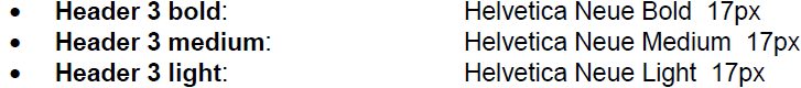
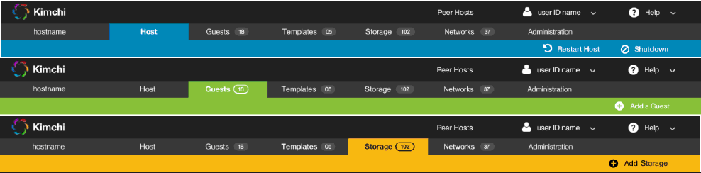
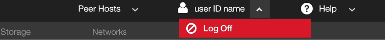
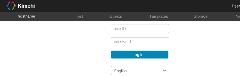
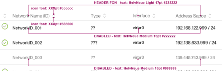
Team, please take time to review the new UI design. No bad suggestion, Just feel free to have your comments. I got comments below: 1. If I understand correctly, the base body content text size is 17px, typically, this is 12px, I think 17px is too large. 2. The tabs have different colors, it adds unnecessary visual and implementation complexity, one color is enough and I prefer blue. 3. I do not think and have never seen that 'logout' need a special red color to emphasize. Why use that icon to indicate logout. 4. Before login, user can do nothing, remove those tabs and Peers... on login screen. When user select a language, the page will be refreshed with selected language. So language selection will need to be prior to input user/password, so language selection should be positioned before user id/password. 5. The UI background is white, the button background is black which contrast the most, looks quite heavy. then it will draw most attention, other content are weakened too much, please change it to be some gray color or just white with a border. 6. Move message area up. 'table/gallery switch', 'sorting', 'filtering' are more related to content. message area in the middle make them separated. 7. Move 'Add' button in dialog to the right will save some vertical space and make content more focused. 8. From my experience before, for popup dialog form, the 'ok', 'cancel' buttons are right aligned. Only inline form, buttons will be left aligned, as those forms in kimchi are popup dialog, buttons should be right aligned. 9. Some font size are expressed in 'pt' like below, whether it is by mistake? 16pt = 21px(http://pxtoem.com/) 10. Some icons are not indicating well-understood metaphors I think.

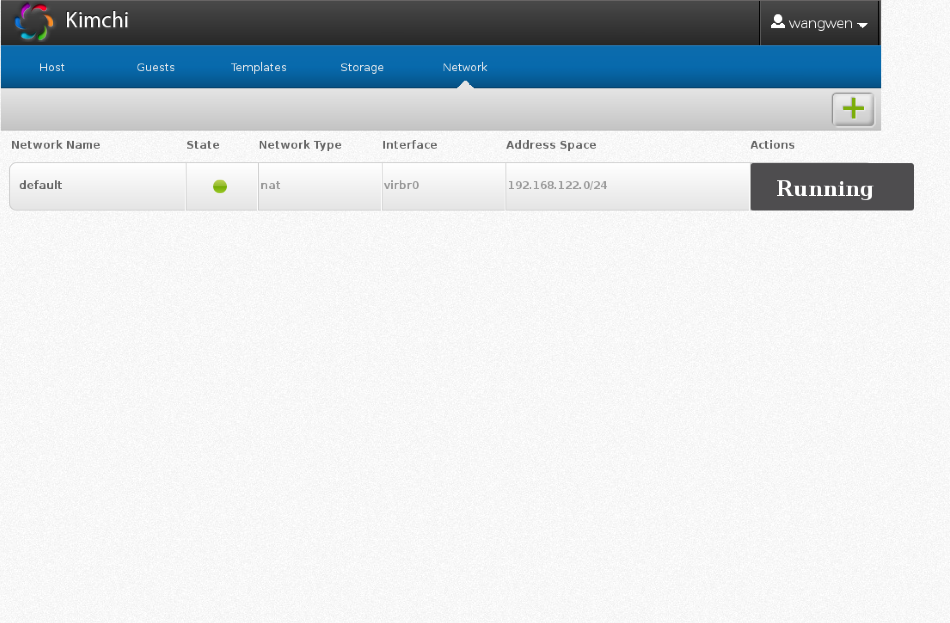
Hi Don, I'm always excited to see the new designs! As with the last one review I had, I think these are really great. I do have some questions about the storage views: - In the gallery view, what are the Status & Filter boxes for? - Related to that, the Filter View -- can you explain how that works? Maybe a couple more images would clarify these first two items for me. - Also in the gallery view, Could we flip the order of the disks' titles and values (e.g. Raw, Volume, 9 GB, 20 GB under Format, Type, Allocation, Capacity)? I was a little thrown when I saw those, before I realized that one was a list of headings, and underneath were values -- especially since the ones on top are bold, and that's what I'm used to seeing for table headings. - I think this may have come up before (so, sorry if I'm just forgetting the reason), but why have both Volumes and Disks as columns? Thanks, - Christy On 12/24/2014 10:11 AM, Don S. Spangler wrote:
All --
I have updated the Kimchi UI design wiki page (UI Design <https://github.com/kimchi-project/kimchi/wiki/UI-Design-Proposals>) with the latest design covering blueprints (icons / graphics, font, color, layout) and interactions for all tabs. Included as well are specific task panels with the design style applied (more panels will be included as we go and can work on specific ones earlier on request). There is ongoing work which will cover responsiveness which will be posted separately when it is completed.
Thanks again to everyone for their feedback on the initial version and we look forward to your thoughts on these updates.
Don Spangler
_______________________________________________ Kimchi-devel mailing list Kimchi-devel@ovirt.org http://lists.ovirt.org/mailman/listinfo/kimchi-devel

Hi, the new UI design looks very nice. I would like to make 2 comments/suggestions (sorry, if these points were already addressed): 1- Would be nice if in GUEST tab, the VMs could be sorted by Running/Not Running 2- In TEMPLATE tab: from the screenshots, it is not clear to me if the names of templates was changed purposely (names showed are only the distro name) If 2 or more templates are created using the same iso, Kimchi is going to give names like (for instance Ubuntu iso) ubuntuXX-UUID1 and ubuntuXX-UUID2 ... currently, the name is cut in the box because it does not fill the space, making templates look like the same and user has to edit each one in order to see the full name. So, I would like to ask you to pay attention at this point and give space to show the full template name or create some type of hover over the name text, to show the full name. Regards, Rodrigo On 12/24/2014 02:11 PM, Don S. Spangler wrote:
All --
I have updated the Kimchi UI design wiki page (UI Design <https://github.com/kimchi-project/kimchi/wiki/UI-Design-Proposals>) with the latest design covering blueprints (icons / graphics, font, color, layout) and interactions for all tabs. Included as well are specific task panels with the design style applied (more panels will be included as we go and can work on specific ones earlier on request). There is ongoing work which will cover responsiveness which will be posted separately when it is completed.
Thanks again to everyone for their feedback on the initial version and we look forward to your thoughts on these updates.
Don Spangler
_______________________________________________ Kimchi-devel mailing list Kimchi-devel@ovirt.org http://lists.ovirt.org/mailman/listinfo/kimchi-devel
3 - Is it possible to create a way to delete more than 1 Debug Report at the same time ?? Like, selecting 2 or more and clicking in a delete button. Rodrigo On 01/07/2015 04:56 PM, Rodrigo Trujillo wrote:
Hi,
the new UI design looks very nice. I would like to make 2 comments/suggestions (sorry, if these points were already addressed):
1- Would be nice if in GUEST tab, the VMs could be sorted by Running/Not Running
2- In TEMPLATE tab: from the screenshots, it is not clear to me if the names of templates was changed purposely (names showed are only the distro name) If 2 or more templates are created using the same iso, Kimchi is going to give names like (for instance Ubuntu iso) ubuntuXX-UUID1 and ubuntuXX-UUID2 ... currently, the name is cut in the box because it does not fill the space, making templates look like the same and user has to edit each one in order to see the full name. So, I would like to ask you to pay attention at this point and give space to show the full template name or create some type of hover over the name text, to show the full name.
Regards,
Rodrigo
On 12/24/2014 02:11 PM, Don S. Spangler wrote:
All --
I have updated the Kimchi UI design wiki page (UI Design <https://github.com/kimchi-project/kimchi/wiki/UI-Design-Proposals>) with the latest design covering blueprints (icons / graphics, font, color, layout) and interactions for all tabs. Included as well are specific task panels with the design style applied (more panels will be included as we go and can work on specific ones earlier on request). There is ongoing work which will cover responsiveness which will be posted separately when it is completed.
Thanks again to everyone for their feedback on the initial version and we look forward to your thoughts on these updates.
Don Spangler
_______________________________________________ Kimchi-devel mailing list Kimchi-devel@ovirt.org http://lists.ovirt.org/mailman/listinfo/kimchi-devel
_______________________________________________ Kimchi-devel mailing list Kimchi-devel@ovirt.org http://lists.ovirt.org/mailman/listinfo/kimchi-devel
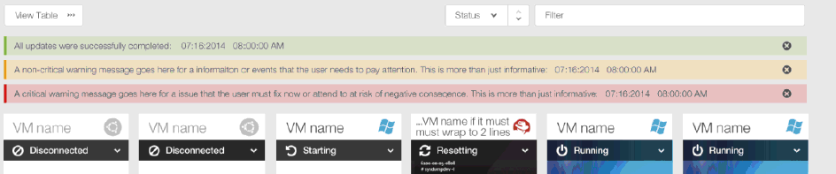
4 - It is not clear to me how ERROR/WARNING inline messages are going to work. I see they now have a 'X' button, to close. Will inline messages have timeout like today ? Rodrigo On 01/08/2015 02:28 PM, Rodrigo Trujillo wrote:
3 - Is it possible to create a way to delete more than 1 Debug Report at the same time ?? Like, selecting 2 or more and clicking in a delete button.
Rodrigo
On 01/07/2015 04:56 PM, Rodrigo Trujillo wrote:
Hi,
the new UI design looks very nice. I would like to make 2 comments/suggestions (sorry, if these points were already addressed):
1- Would be nice if in GUEST tab, the VMs could be sorted by Running/Not Running
2- In TEMPLATE tab: from the screenshots, it is not clear to me if the names of templates was changed purposely (names showed are only the distro name) If 2 or more templates are created using the same iso, Kimchi is going to give names like (for instance Ubuntu iso) ubuntuXX-UUID1 and ubuntuXX-UUID2 ... currently, the name is cut in the box because it does not fill the space, making templates look like the same and user has to edit each one in order to see the full name. So, I would like to ask you to pay attention at this point and give space to show the full template name or create some type of hover over the name text, to show the full name.
Regards,
Rodrigo
On 12/24/2014 02:11 PM, Don S. Spangler wrote:
All --
I have updated the Kimchi UI design wiki page (UI Design <https://github.com/kimchi-project/kimchi/wiki/UI-Design-Proposals>) with the latest design covering blueprints (icons / graphics, font, color, layout) and interactions for all tabs. Included as well are specific task panels with the design style applied (more panels will be included as we go and can work on specific ones earlier on request). There is ongoing work which will cover responsiveness which will be posted separately when it is completed.
Thanks again to everyone for their feedback on the initial version and we look forward to your thoughts on these updates.
Don Spangler
_______________________________________________ Kimchi-devel mailing list Kimchi-devel@ovirt.org http://lists.ovirt.org/mailman/listinfo/kimchi-devel
_______________________________________________ Kimchi-devel mailing list Kimchi-devel@ovirt.org http://lists.ovirt.org/mailman/listinfo/kimchi-devel
_______________________________________________ Kimchi-devel mailing list Kimchi-devel@ovirt.org http://lists.ovirt.org/mailman/listinfo/kimchi-devel

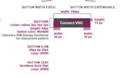
Hi Don, I have encountered some issues while doing the new UI work. For the buttons, it seems that the size are not in the appropiate. The font-size might be too big and the unit using"pt" should better be replaced by "px" that go with other designs of the rest of kimchi. Here are the snapshot below: design: original: changed: Best Regards Wen Wang 在 12/25/14 12:11 AM, Don S. Spangler 写道:
All --
I have updated the Kimchi UI design wiki page (UI Design <https://github.com/kimchi-project/kimchi/wiki/UI-Design-Proposals>) with the latest design covering blueprints (icons / graphics, font, color, layout) and interactions for all tabs. Included as well are specific task panels with the design style applied (more panels will be included as we go and can work on specific ones earlier on request). There is ongoing work which will cover responsiveness which will be posted separately when it is completed.
Thanks again to everyone for their feedback on the initial version and we look forward to your thoughts on these updates.
Don Spangler
_______________________________________________ Kimchi-devel mailing list Kimchi-devel@ovirt.org http://lists.ovirt.org/mailman/listinfo/kimchi-devel
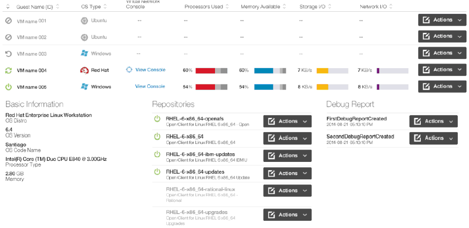
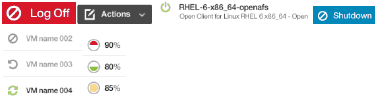
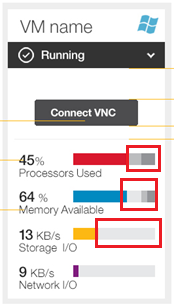
Hi Don, I got some issues of the gauge as below: I the snapshot, we can clearly see that there are 2 or 3 grey colors in the gauge. some has only one light grey color. I wonder if we can use only one grey color for the unused part. Also, the height and length of the gauge is not given and I might need the exact height and width for that. Best Regards Wang Wen On 12/25/2014 12:11 AM, Don S. Spangler wrote:
All --
I have updated the Kimchi UI design wiki page (UI Design <https://github.com/kimchi-project/kimchi/wiki/UI-Design-Proposals>) with the latest design covering blueprints (icons / graphics, font, color, layout) and interactions for all tabs. Included as well are specific task panels with the design style applied (more panels will be included as we go and can work on specific ones earlier on request). There is ongoing work which will cover responsiveness which will be posted separately when it is completed.
Thanks again to everyone for their feedback on the initial version and we look forward to your thoughts on these updates.
Don Spangler
_______________________________________________ Kimchi-devel mailing list Kimchi-devel@ovirt.org http://lists.ovirt.org/mailman/listinfo/kimchi-devel
participants (5)
-
 Christy Perez
 -
 Don S. Spangler
 -
 Rodrigo Trujillo
 -
 Wen Wang
 -
 Yu Xin Huo